
Wikipedia:Graphics Lab/Map workshop/Archive/Dec 2015
Depth Map for Mediterranean
- Article(s)
- Depth Map for Mediterranean
- Request
- I noticed that you do not have a depth map for the Mediterranean sea. The only one I found was at http://www.divinglore.com/Genesis/Mediterranean%20Depth%20Chart.html. I think Wikipedia should have one. I am not tech savy so hope this gets to you. You could have made it easier for less accomplished users. Tom T. Moore
Looks good. 78.148.76.61 (talk) 17:18, 20 April 2016 (UTC)
- Graphist opinion(s)
![]() Request taken by Ikonact (talk) 00:25, 8 January 2015 (UTC).
Request taken by Ikonact (talk) 00:25, 8 January 2015 (UTC).
Hi, here is a first attempt. Please let me know if this is OK. --Ikonact (talk) 00:25, 8 January 2015 (UTC)
-
 Bathymetry map of the Mediterranean Sea

Mamasapano incident map
- Article(s)
- 2015 Mamasapano clash
- Request
- Please create a comprehensive map of the incident. Using maps from this Source. Maybe someone who has an experience creating battle maps can help me with this request-- Hariboneagle927 (talk) 09:47, 10 February 2015 (UTC)
- Graphist opinion(s)
@Hariboneagle927: I think you have to be a bit more specific as your link contains a lot of information. You have to understand that we (graphic workers) have zero knowledge of this subject. You have to tell us exactly what you want and provide us with the information we need, and just the information we need. Then we can create something for you. --Goran tek-en (talk) 20:07, 2 March 2015 (UTC)
Shaded relief map of Los Santos Province
-
 Shaded relief map of Los Santos Province done with an old map.

- Article(s)
- Los Santos Province
- Request
- Hi, I need a shaded relif map for Los Santos province, to use in both English and Spanish wikipedia. There is an old one that can be improved. I this link you can find some political maps of the province. here is map of the country, a shaded relief with name of cities. I'd be very grateful if someone can do a good map for this province. I tried but I am not good at it. … -- 62.254.75.81 (talk) 20:34, 22 February 2015 (UTC)
- Graphist opinion(s)
I don't sure that satisfies your needs, but here is relief map I created: File:Panama Los Santos relief map.png. -- NZeemin (talk) 19:30, 24 April 2016 (UTC)

Interstate 895 (Rhode Island–Massachusetts)
Philg88 ♦talk 09:18, 10 November 2015 (UTC)
- Article(s)
- Interstate 895 (Rhode Island–Massachusetts)
- Request
- I think it would enrich the article about that proposed highway if we had a map. The path is described in the article and I tried to render it using Openstreetmap, but it was more complicated than what I anticipated. Would somebody like to make the map for me? Thanks! -- bcartolo (talk) 19:54, 27 February 2015 (UTC)
- Graphist opinion(s)
Kingston, Jamaica metropolitan area
Still wanted... 95.146.115.122 (talk) 13:00, 15 December 2015 (UTC)
-
 The only blank map of Jamaica available currently.
 -
 Detail map of London, England metro area.


- Request
- The current football season in Jamaica has 7 teams in the Kingston area alone. There needs to be a larger detail map of the Kingston metropolitan area to help place the locations of the different teams in a clear way. This map could also be used in the Jamaica page, as well as the Kingston parish and city pages, respectively. Please see the map of London in the gallery for an example what I'm looking to accomplish. -- IKwasowski (talk) 08:53, 5 March 2015 (UTC)
- Seconded. There are over fifty buildings, etc in Category:Kingston, Jamaica that this could be used on. -Arb. (talk) 19:19, 6 March 2015 (UTC)
- Sources
From https://www.lib.utexas.edu/maps/jamaica.html City Maps
- Kingston - Central Sheet 1:10,000 Directorate of Overseas Surveys, D.O.S. 201, 1962 (16.4MB)
- Kingston - Sheet 1 1:10,000 Directorate of Overseas Surveys, D.O.S. 201, 1965 (11.0MB)
- Kingston - Sheet 2 1:10,000 Directorate of Overseas Surveys, D.O.S. 201, 1965 (9.2MB)
- Kingston - Sheet 3 1:10,000 Directorate of Overseas Surveys, D.O.S. 201, 1963 (16.1MB)
- Kingston - Sheet 4 1:10,000 Directorate of Overseas Surveys, D.O.S. 201, 1963 (11.6MB)
- Kingston - Sheet 5 1:10,000 Directorate of Overseas Surveys, D.O.S. 201, 1963 (14.7MB)
- Kingston - Sheet 6 1:10,000 Directorate of Overseas Surveys, D.O.S. 201, 1963 (16.8MB)
These are all UK Governement publications with a fifty year copyright which has expired. In Wikimedia Commons terms they'd have an {{OldOS}} licence.
More modern source: http://www.openstreetmap.org/#map=13/18.0125/-76.7924
- Graphist opinion(s)
Location map Dhaka (within Bangladesh)
- Request
A location map for Dhaka within Bangladesh.
To be used primarily on building and street articles eg Curzon Hall of which there are over 100 in Category:Buildings and structures in Dhaka.
Possible source map: http://www.openstreetmap.org/#map=13/23.7387/90.4008
-Arb. (talk) 19:08, 6 March 2015 (UTC)
- Graphist opinion(s)
Wharf map of London

I've photographed an out-of-copyright 1905 map of the River Thames wharves in central and east London. It needs to be stitched together - there are six segments divided between two horizontal strips, each with three segments at the top and three at the bottom. The colours also need to be equalised and the segments need to be correctly sized and positioned alongside each other. The segments are:
- File:Thames wharf map top left third.jpg
- File:Thames wharf map top middle third.jpg
- File:Thames wharf map top right third.jpg
- File:Thames wharf map bottom left third.jpg
- File:Thames wharf map bottom middle third.jpg
- File:Thames wharf map bottom right third.jpg
Could someone please help with this? Prioryman (talk) 21:23, 2 April 2015 (UTC)
- I have some software designed to do that; but it requires at least some overlap between each pair of adjacent segments. My impression is that the 1st and 2nd have a gap between them (ok, maybe no gap, but no overlap as required: look at London Bridge station), and the 5th and 6th have no overlap. Maproom (talk) 21:33, 2 April 2015 (UTC)
- I think the gaps exist on the original map. It consists of a sheet of cloth onto which squares of map have been glued, so there are gaps between the individual squares. I presume they made it that way to be more resistant to folding than it would be if it was a single sheet of paper. Prioryman (talk) 21:48, 2 April 2015 (UTC)
- Ah, that's what the OS called the "dissected" edition. They stopped making these by the end of 1952, but they carried on making the non-dissected cloth-backed maps until circa 1967. --Redrose64 (talk) 23:15, 2 April 2015 (UTC)
- Interesting, I didn't know that. It's not an OS map so I'd guess they weren't the only ones producing maps in that style. Is it possible to put it together, albeit with gaps? Prioryman (talk) 07:09, 3 April 2015 (UTC)
- @Maproom: Do you want to do this? If not let me know and I'll get my sellotape out. Cheers, Philg88 ♦talk 07:20, 7 April 2015 (UTC)
- Please go ahead. I have a rather full schedule just now. Maproom (talk) 07:44, 7 April 2015 (UTC)
- @Maproom: Do you want to do this? If not let me know and I'll get my sellotape out. Cheers, Philg88 ♦talk 07:20, 7 April 2015 (UTC)
- Interesting, I didn't know that. It's not an OS map so I'd guess they weren't the only ones producing maps in that style. Is it possible to put it together, albeit with gaps? Prioryman (talk) 07:09, 3 April 2015 (UTC)
- Ah, that's what the OS called the "dissected" edition. They stopped making these by the end of 1952, but they carried on making the non-dissected cloth-backed maps until circa 1967. --Redrose64 (talk) 23:15, 2 April 2015 (UTC)
- I think the gaps exist on the original map. It consists of a sheet of cloth onto which squares of map have been glued, so there are gaps between the individual squares. I presume they made it that way to be more resistant to folding than it would be if it was a single sheet of paper. Prioryman (talk) 21:48, 2 April 2015 (UTC)
@Prioryman: After some resizing and cropping, this is what it looks like. Unfortunately, because the photos were taken from different angles/distances (even minute changes have a major effect), this is the best I can come up with. Philg88 ♦talk 05:39, 9 April 2015 (UTC)
EAF - Somalia and South Sudan
.svg?lang=en)
- Article(s)
- East African Federation
- Request
- Maybe someone could colour Somalia and South Sudan in a lighter shade of green, as they have applied to join the East African Community and could potentially form part of the proposed East African Federation.
- Graphist opinion(s)
- @Snow Lion Fenian:, I think it might be speculating too much to change the Federation map, since they are not part of the East African Community yet. I would propose changing File:East African Community (orthographic projection).svg to show that they have ongoing applications to join. Maybe even highlight Sudan light red/orange for a failed bid. What are your thoughts? Jolly Ω Janner 21:01, 5 November 2015 (UTC)
OAPAC members - South Sudan

- Request
- South Sudan is no longer part of Sudan or OAPAC, hence it needs to be coloured grey on the above map to reflect that.
- Graphist opinion(s)
![]() Request taken.: immediately. @Snow Lion Fenian:, I cannot find any evidence in the article nor after a quick look at the OAPEC website, that Mauritania, Sudan, Yemen and Oman are possible future members. Unless you know where this evidence can be found, I'm inclined to omit this from the new map. Jolly Ω Janner 03:03, 1 November 2015 (UTC)
Request taken.: immediately. @Snow Lion Fenian:, I cannot find any evidence in the article nor after a quick look at the OAPEC website, that Mauritania, Sudan, Yemen and Oman are possible future members. Unless you know where this evidence can be found, I'm inclined to omit this from the new map. Jolly Ω Janner 03:03, 1 November 2015 (UTC)
Plane crash Seville
;Article(s):
- Request
- Could anybody create a map of this -> flight route? -- S078 13:35, 9 May 2015 (UTC)
- Graphist opinion(s)
 Not done @S078: Sorry, but the link is now dead and I couldn't find it on web archives of the URL either. There was only one image I can find of the flight path, but it was from an aviation magazine. I think this one may have to be left, unless the flight path can be found on a reliable source. As far as I recall, it crashed 3 miles from the airport, so there was not much of a flight path. Jolly Ω Janner 03:39, 1 November 2015 (UTC)
Altai Mountains

- Article(s)
- Altai Mountains
- Request
- I noticed that the map in the infobox in Altai Mountains is not a very good map. It's a bit fuzzy and the labels are not in English. I don't know how to find a better map. Perhaps somebody here could find or make one. Thanks. CorinneSD (talk) 22:27, 11 May 2015 (UTC)
- Graphist opinion(s)
@CorinneSD: Same as for your other request. You have to think about that we are graphic workers with zero knowledge of all the different subjects. You as the requester has to provide translations, information, knowledge, help and feedback so we can do the graphic work. We don't do research or investigations, please understand that, thanks. --Goran tek-en (talk) 18:37, 25 July 2015 (UTC)
- Goran tek-en Oh. Thanks for the explanation. - CorinneSD (talk) 23:25, 26 July 2015 (UTC)
Manchu people

- Article(s)
- Manchu people
- Request
- I just saw this map in the article on Manchu people in the section Manchu people#Origins and early history. I don't think it's a particularly good map, and the labels are not in English. Could somebody find or make a better map? CorinneSD (talk) 22:58, 11 May 2015 (UTC)
- Graphist opinion(s)
@CorinneSD: To be able to even start to do something we would need all of the translations and that someone could give us information on the meaning of the different colors. --Goran tek-en (talk) 18:32, 25 July 2015 (UTC)
Battle of Palmito Ranch

- Article(s)
- Battle of Palmito Ranch
- Request
- please wikify… -- Kintetsubuffalo (talk) 03:05, 12 May 2015 (UTC)
- Graphist opinion(s)
I think you mean to turn it into a svg without the background? Houdinipeter (talk) 03:34, 23 April 2016 (UTC)
China - Anhui, Gansu, Guizhou, and Jiangsu
- Article(s)
The other regions have hundreds of article using their maps
- Request
These regions are missing location maps. They are the only ones in china that are missing. Would be very useful to have them! ShakyIsles (talk) 00:04, 8 July 2015 (UTC)
- I second this request (which has been made several times before). These are provinces each with tens of millions of people and thousands of cities and towns. Zhejiang, Shaanxi, Beijing, Tianjin location maps are also missing. See Category:China location map templates. -Zanhe (talk) 05:17, 24 November 2015 (UTC)
- Graphist opinion(s)
British Empire in 1952


- Article(s)
- Elizabeth II of the United Kingdom, British Empire
- Request
- Could someone please create a PNG map of the British Empire as it was in 1952, at the start of Elizabeth II's reign, using the shaded countries from the first map (above left) and the borders of the world featured on the Map of the 1952 Olympics (above right). The colonies and protectorates should be shown in dark red, and the dominions - Canada, Australia (including Papua New Guinea), New Zealand, South Africa (including Namibia), Pakistan (including Bangladesh) and Ceylon/Sri Lanka - should be in pink.
User:Snow Lion Fenian — Preceding unsigned comment added by 5.134.90.140 (talk) 18:10, 19 May 2015
- Graphist opinion(s)
China-Pakistan Economic Corridor
Would someone be able to create a map for the China-Pakistan Economic Corridor using the model supplied here? The article is badly in need of a map. Currently, the ones that have been used have all been taken from somewhere in the internet and deleted for copyright. I can't find a free or public version. Hence, it would be great if someone here could do the cartography. The link I've given is reliable, as the map has been designed by the National Highways Authority (Pakistan) and has their logo on it. Mar4d (talk) 14:07, 23 May 2015 (UTC)
- Also, that map uses the term Indian Occupied Kashmir for Indian-administered Kashmir, but for NPOV purposes, it may be better to have a map that uses Jammu and Kashmir, the official name of the disputed territory. Mar4d (talk) 14:08, 23 May 2015 (UTC)
- I will suggest to creators that, using bare term Jammu and Kashmir in Pakistan map will suggest that Jammu and Kashmir is one of state of Pakistan while in reality it is one of democratic state of India. so better term should be used in map will be "Indian administered Kashmir" for Indian side and "Pakistan administered Kashmir" for Pakistan side of Kashmir. United Nations maps do have such terms. If Pakistan side of Kashmir is not mentioned as "Pakistan administered Kashmir" then that Map will be nominated for deletion on Wikimedia. --Human3015 Say Hey!! • 16:03, 23 May 2015 (UTC)
- It's a map of Pakistan. Like all the other maps, all the provinces have their own names, including Pakistan-administered Kashmir. The only reason why Jammu and Kashmir is added is because it's a territorial claim. Mar4d (talk) 16:50, 23 May 2015 (UTC)
- Pakistan government itself consider "Paksitan administered Kashmir" as "disputed territory". see map on Pakistan's government site. This map can be seen on all Pakistan's government websites. If both side of Kashmir is disputed then why only Indian side should be called as "Administered side". It is map of "only" Pakistan on government websites still they show "Pak administered Kashmir" as "disputed" one. So there should be no question regarding this issue that both sides should be called as "administered side".--Human3015 Say Hey!! • 17:06, 23 May 2015 (UTC)
- You showed me one map, but there are thousands of maps and I can show you any with Jammu and Kashmir. Pakistan doesn't dispute Kashmir as its claimed territory, it only disputes its status. This article is on the China-Pakistan Economic Corridor, not the Kashmir conflict, so such maps are not relevant. As a major portion of the project is concentrated in Gilgit-Baltistan, an official map accurately showing the territory and all the other Administrative units of Pakistan would be required. And by the way, you won't find any official map of Pakistan where Kashmir is excluded. Mar4d (talk) 18:48, 23 May 2015 (UTC)
- If you can show me "thousands of maps" then please show 10 maps from Pakistan's government websites. If this article is about China and Pakistan then no need to show Indian state in it. If Pakistan claims Jammu and Kashmir then India also claims Pakistan side of Kashmir. I can show "thousands of Maps" from Indian government websites. You will say this is article about Pakistan, then it doesn't mean that Government of Pakistan owns this article. We have to write article on the basis of international standards, not on local standards. Anyway, don't debate on it. I was just giving my opinion to creators, not to you. Hope creators got my point. This is sensitive issue and any wrong map will be nominated for deletion on Wikimedia commons. Thank you.--Human3015 Say Hey!! • 19:05, 23 May 2015 (UTC)
- You showed me one map, but there are thousands of maps and I can show you any with Jammu and Kashmir. Pakistan doesn't dispute Kashmir as its claimed territory, it only disputes its status. This article is on the China-Pakistan Economic Corridor, not the Kashmir conflict, so such maps are not relevant. As a major portion of the project is concentrated in Gilgit-Baltistan, an official map accurately showing the territory and all the other Administrative units of Pakistan would be required. And by the way, you won't find any official map of Pakistan where Kashmir is excluded. Mar4d (talk) 18:48, 23 May 2015 (UTC)
- Pakistan government itself consider "Paksitan administered Kashmir" as "disputed territory". see map on Pakistan's government site. This map can be seen on all Pakistan's government websites. If both side of Kashmir is disputed then why only Indian side should be called as "Administered side". It is map of "only" Pakistan on government websites still they show "Pak administered Kashmir" as "disputed" one. So there should be no question regarding this issue that both sides should be called as "administered side".--Human3015 Say Hey!! • 17:06, 23 May 2015 (UTC)
- It's a map of Pakistan. Like all the other maps, all the provinces have their own names, including Pakistan-administered Kashmir. The only reason why Jammu and Kashmir is added is because it's a territorial claim. Mar4d (talk) 16:50, 23 May 2015 (UTC)
University article of Vasantrao Naik Marathwada Agricultural University is under construction. As every university article has its logo in infobox, this article also needs logo. this is official website of the university. This is agriculture university of Government of India, so it very important article which very stub right now. This university is one of only 4 agri universities of Maharashtra state and has enormous campus which includes 40-50 villages.(as it is a agri university). So article needs to be good. You can see logo on upper left corner of the official website. Kindly help. Thank you. --Human3015 Say Hey!! • 04:20, 24 May 2015 (UTC)
- If you want a logo, ask for it in the Illustration Workshop. This is the Map Workshop.Wereldburger758 (talk) 06:38, 24 May 2015 (UTC)
Maps for Baluchi dialects
- Western Baluchi: Afghanistan, Southern Pakistan, Turkmenistan and Uzbekistan (Turkmenistan), Iran
- Eastern Baluchi: Southern Pakistan, India, Map 1
- Southern Baluchi: Southern Pakistan, Oman, South part of Sistan and Baluchestan Province from Western Baluchi
Thank you. Mjbmr (talk) 11:32, 24 May 2015 (UTC)
@Mjbmr: Please use the "New request" link at the top as it gives us all the code we need. I don't understand your request so you will have to explain it much more. Please remember that the graphic workers probably have zero knowledge of the subject, thanks. --Goran tek-en (talk) 19:33, 8 July 2015 (UTC)
Channels of the Hawaiian Islands
- Article(s)
- Channels of the Hawaiian Islands
- Request
- Please create a map indicating all the channels of the Hawaiian Islands using maps of the island chain found on commons:Category:Maps of Hawaii. The result should look something like this. -- KAVEBEAR (talk) 16:26, 3 June 2015 (UTC)
- Graphist opinion(s)
![]() Request taken by Houdinipeter (talk) 23:17, 23 April 2016 (UTC).
Request taken by Houdinipeter (talk) 23:17, 23 April 2016 (UTC).
Ming Empire map
Warning I'm beginner editor of Wikipedia, and I need the help of a high-ranking member who knows how to create a map and who has knowledge of historical China especially Ming Empire. As you can deduce from my words yes I'm intent on creating a Ming Empire, with provinces and prefectures(smaller districts). This map may take you some toll, I will provide with the resources and what the map looks like of course as part of resources exchange. Maybe even a team can work together. Alexis Ivanov (talk) 21:10, 13 June 2015 (UTC)
- Welcome and we all learn all the time from each other. First it would be good if you used the "—New request—" link at the top of the page as that gives us all the code within a request that we need during the work with it. So please se if you can correct that.
- I don't really understand what you mean by a "high-ranking member", maybe you mean experienced? It seems like you want to create a map which will be comprehensive in many aspects and will have to be planned thoroughly. I don't really know if you will be able to find a graphic worker who also has knowledge of "historical China especially Ming Empire", sounds like it will be hard.
- I have zero knowledge of the subject but if you can't find any graphic worker with that knowledge you can contact me as it sounds like an interesting project, thanks. --Goran tek-en (talk) 15:13, 14 June 2015 (UTC)
- Has anything happened with this? I happen to be somewhat familiar with Chinese history and I know a bit about maps too. Feel free to ping me to discuss further. Philg88 ♦talk 09:54, 19 July 2015 (UTC)
1945 Map of British Empire

- Article(s)
- British Empire, British Empire in World War II
- Request
- Could someone please create a new map of the British Empire as it was in 1945, using the above map, which shows all colonial Empires after WWII, as a guide.
User:Snow Lion Fenian — Preceding unsigned comment added by 5.134.90.140 (talk) 17:50, 15 June 2015
- Graphist opinion(s)
Pre-partition map of Ireland showing traditional 32 counties

- Article(s)
- Irish League 1890-91
- Request
- Is it possible to have a map like this one, but treating Ireland pre-1921, i.e. showing the six NI counties and without showing the border? Mooretwin (talk) 14:56, 16 June 2015 (UTC)
- Graphist opinion(s)


Will one of these, already on Commons, do? If you like I can make a version with the six counties recoloured to match the others. And I can make the sea and lakes blue.Maproom (talk) 15:47, 17 June 2015 (UTC)
- Yes, I think the first one would work well with the six counties recoloured as you suggest. Many thanks. Mooretwin (talk) 09:07, 18 June 2015 (UTC)
- Will do. I will also make the sea and lakes blue, as in the map on the right. Maproom (talk) 09:16, 18 June 2015 (UTC)

![]() Done
Done
We have found that this does not work. The requested map needs, I think, to be associated in some way with the "Location map" template. I have no idea how to do this, or even if it is possible. Can anyone advise? Maproom (talk) 09:02, 19 June 2015 (UTC)
- @Maproom: To use the Location map template you need to know the top left and bottom right coordinates of the area under the map. It's then a fairly simple process to create the necessary files. Cheers, Philg88 ♦talk 10:05, 19 June 2015 (UTC)
- How do we get those coordinates? 194.32.31.1 (talk) 08:41, 23 June 2015 (UTC)
- That's the hard part. You could export a new map from OpenStreetMap and use some other GIS tools to create the map. Philg88 ♦talk 11:27, 23 June 2015 (UTC)
- Jeez. That's well beyond my capability. Can anyone help? 194.32.31.1 (talk) 08:11, 24 June 2015 (UTC)
- That's the hard part. You could export a new map from OpenStreetMap and use some other GIS tools to create the map. Philg88 ♦talk 11:27, 23 June 2015 (UTC)
- How do we get those coordinates? 194.32.31.1 (talk) 08:41, 23 June 2015 (UTC)
Switch color scheme
-
 US states by religiosity

- Article(s)
- Christianity in the United States, List of U.S. states by religiosity, Religion in the United States
- Request
- The color scheme, from red to yellow to green, is hard for me to understand due to colorblindness; Maine and Mississippi look rather similar to me, and Connecticut and Kentucky are identical. Could you switch the color scheme, perhaps something like red to yellow to dark blue? No point in retaining the "No data" option, since every state has data here. Nyttend (talk) 23:34, 18 June 2015 (UTC)
- Graphist opinion(s)
- Near the start of the SVG source is the following element:
  <style
     type="text/css"
     id="style3">
    .gt54  { fill: #ff0000; } /* gt 54% */
    .gte50 { fill: #ff6600; } /* 50%-54% */
    .gte45 { fill: #ff9400; } /* 45%-49% */
    .gte40 { fill: #fec500; } /* 40%-44% */
    .gte35 { fill: #ffff00; } /* 35%-39% */
    .gte30 { fill: #8cc700; } /* 30%-34% */
    .gte25 { fill: #0fad00; } /* 25%-30% */
    .lt25  { fill: #00a3c7; } /* lt 25% */
    .na    { fill: #999999; } /* no data */
  </style>
These nine fill: values represent the nine colours respectively, so it's a simple matter of adjusting the ones that are less distinguishable. The first and last can probably stay the same, and the eighth probably can too, so six replacement colours need to be chosen. All other colours (both fill and stroke) in the drawing are blacks and greys, which need not be altered. --Redrose64 (talk) 10:43, 19 June 2015 (UTC)
- apparently there is a standard palette that is color-blind unambiguous. Search Color Universal Design (CUD) then jfly.iam.u-tokyo etc, about 4/5ths of the way down, and several other places. If I wre loading this I would resort the numbers from dark to light to indicate %-sequences. Benjamin Trovato (talk) — Preceding undated comment added 15:03, 19 June 2015 (UTC)
- I was wondering about these: it's an even spread of hue, but going from red to cyan through violet and blue. --Redrose64 (talk) 15:19, 19 June 2015 (UTC)
- If you're red-green colorblind, blues and purples can be confusing because you don't see (or see poorly) the red influence on the purple. Nyttend (talk) 14:31, 25 June 2015 (UTC)
- I was wondering about these: it's an even spread of hue, but going from red to cyan through violet and blue. --Redrose64 (talk) 15:19, 19 June 2015 (UTC)
![]() Request taken by Goran tek-en (talk) 18:41, 7 July 2015 (UTC).
Request taken by Goran tek-en (talk) 18:41, 7 July 2015 (UTC).
- @Nyttend: Have a look at this draft. According to color brewer this should be OK for color blind people. If not then we will have to use different patterns, give me feedback, thanks. --Goran tek-en (talk) 19:25, 8 July 2015 (UTC)
- That's easy. It's just a lighter-to-darker scheme; presumably even a monochromat would be able to understand it. Nyttend (talk) 19:30, 8 July 2015 (UTC)
- I don't understand what you mean "That's easy" because then you maybe can do it by yourself.
- Normally one recommends not more than five steps to make a really true map for everyone to be able to view. This scheme is as close to a monochromatic as you can get but instead with blue color, no real difference. Also you didn't give me any feedback on my draft. Please just tell me if it works or not. --Goran tek-en (talk) 19:43, 8 July 2015 (UTC)
- That was the feedback. I meant that it's easy to understand your draft, so easy that monochromats (people who can't see any color at all, who see everything in various shades of grey) could still understand it. Nyttend (talk) 19:45, 8 July 2015 (UTC)
- @Goran tek-en: I notice that you didn't adjust the colour values in the
<style>...</style>element (as I suggested at 10:43, 19 June 2015), instead you left those alone and added afill:property to every separate shape. This makes it much more difficult to change the colours in future. --Redrose64 (talk) 20:13, 8 July 2015 (UTC)- @Nyttend: I'm sorry for misunderstanding you, my apologies. Do you want this to be uploaded as a new file or replacing the other one. If you want it uploaded as a new I will need the following;
- Name of the file
- Description
- Category/ies at commons
- to be able to upload it at commons. --Goran tek-en (talk) 08:15, 9 July 2015 (UTC)
- Thanks! Please upload it on top of the current one. Nyttend (talk) 14:18, 9 July 2015 (UTC)
- @Nyttend: I'm sorry for misunderstanding you, my apologies. Do you want this to be uploaded as a new file or replacing the other one. If you want it uploaded as a new I will need the following;
- @Goran tek-en: I notice that you didn't adjust the colour values in the
- That was the feedback. I meant that it's easy to understand your draft, so easy that monochromats (people who can't see any color at all, who see everything in various shades of grey) could still understand it. Nyttend (talk) 19:45, 8 July 2015 (UTC)
- I don't understand what you mean "That's easy" because then you maybe can do it by yourself.
- That's easy. It's just a lighter-to-darker scheme; presumably even a monochromat would be able to understand it. Nyttend (talk) 19:30, 8 July 2015 (UTC)
- @Nyttend: Have a look at this draft. According to color brewer this should be OK for color blind people. If not then we will have to use different patterns, give me feedback, thanks. --Goran tek-en (talk) 19:25, 8 July 2015 (UTC)
@Redrose64: I'm that type of graphic worker who prefer to work with what I see and in Inkscape, so to me my way is easier. I do understand your point that it could be easier to edited in a text editor your way, but I need to see things, and search-replace works also. I'm trying to do stuff in the code and I will of course learn more as time goes but so far it's harder for me. --Goran tek-en (talk) 08:23, 9 July 2015 (UTC)
![]() Done
Done
Moscow Canal
-
 Moskva River within the Volga watershed

- Article(s)
- Moskva River
- Request
Hi, I would like to request that a label "Moscow Canal", in blue text, be added to this map (the canal is mentioned in the caption at Moskva River, but not actually marked). The Moscow Canal is the short waterway running approximately north from Moscow to the Volga River. At the same time, I would like to request that the canal symbol (short blue 'ticks') is made more obvious. At normal viewing scale it is very faint and virtually indistinguishable from a river. Thanks! — Preceding unsigned comment added by 31.51.134.46 (talk) 20:30, 22 June 2015
- Graphist opinion(s)
Who is requesting this, you didn't sign and therefore I guess you wont get much help. --Goran tek-en (talk) 19:22, 8 July 2015 (UTC)
- I wasn't aware that only people with accounts could make requests here. 109.153.245.25 (talk) 19:39, 12 July 2015 (UTC)
- Anyone can make requests here, registered user or not. What Goran tek-en means is that the person who made the original request didn't sign their post. --Redrose64 (talk) 07:55, 13 July 2015 (UTC)
- I wasn't aware that only people with accounts could make requests here. 109.153.245.25 (talk) 19:39, 12 July 2015 (UTC)
- I just did this in Windows Paint, but it's possible that someone else might want to do it in a prettier fashion. Nyttend (talk) 14:22, 9 July 2015 (UTC)
- Thanks for your efforts. The label should be blue, as I mentioned. I realise there is very little space, but the canal symbol does not look great, to be perfectly honest. Also the colour looks different from the other blues. 109.153.245.25 (talk) 19:39, 12 July 2015 (UTC)
Map of the Migrations of the Alans
- Article(s)
- Alans
- Request
- I find the colors a little confusing in this map. The legend mentions yellow for areas where Alans settled, red [lines] for routes taken by civilians, and orange [lines] for military excursions. However, one of the red lines, the shorter one below the long one, looks a little orange, and the short, thin lines proceeding from the yellow settlement areas look too yellow to be called orange. Is there any way to make the military excursions look truly orange and the red lines to look really red? I presume the military excursions are the pale orange-yellow ones proceeding from the yellow settlement areas, but I'm not sure. Perhaps if one or both lines were another color, such as blue or purple, there would be no possibility of confusion. CorinneSD (talk) 22:36, 29 June 2015 (UTC)
- Graphist opinion(s)
@CorinneSD: It's very hard to do something very good on that bitmap image, a lot of work and we still have a low resolution jpg.
I suggest that we make a svg version of this map instead. I have found a base map that is also topographic if you want that but maybe it's OK to use a flat base map, it's up to you. If you want this, contact me and I will help you. You have to contact me directly as the watch and ping doesn't work all the time for me, thanks. --Goran tek-en (talk) 18:23, 25 July 2015 (UTC)
Ireland counties recoloured - as .svg
- Article(s)
- Irish League 1890-91
- Request
- This map was kindly created as a .jpg, but as I need to plot locations on it, apparently it needs to be .svg. Can the map be converted to .svg? Mooretwin (talk) 15:56, 30 June 2015 (UTC)
- Graphist opinion(s)
- Converting JPEG to SVG is fraught with many problems, not least of which is the completely different philosophies (raster graphics vs vector graphics). It would be easier, I think, to use one of the existing SVG maps as a starting point, and recolour that. At the original request, two SVGs were displayed: File:Ireland trad counties named ga.svg and File:Counties of the island of Ireland.svg and I think that the second of these would be most suitable. --Redrose64 (talk) 16:28, 30 June 2015 (UTC)
- Thank you very much. I agree that the second would be most suitable. However, I attempted to use that map as-is (i.e. with the same colouring), and this is what happened -
Lua error in Module:Location_map/multi at line 13: Unable to find the specified location map definition. Neither "Module:Location map/data/Counties of the island of Ireland" nor "Template:Location map Counties of the island of Ireland" exists. Mooretwin (talk) 10:07, 2 July 2015 (UTC)
- That error message doesn't mean a fault with the map, it means that the country name "Counties of the island of Ireland" isn't registered with the
{{location map+}}suite. It shouldn't be: instead, the first unnamed parameter should stay as|Ireland, with other parameters being used to obtain the map data (name, corner coordinates, etc.) that should be set in{{Location map Ireland}}. --Redrose64 (talk) 16:29, 2 July 2015 (UTC)- Thanks for your reply, but I'm afraid I don't understand what I need to do. Could you create the map I need here, and then I can use it as a template? Mooretwin (talk) 10:08, 6 July 2015 (UTC)
- Hello? Can anyone help? Mooretwin (talk) 10:52, 15 July 2015 (UTC)
- Thanks for your reply, but I'm afraid I don't understand what I need to do. Could you create the map I need here, and then I can use it as a template? Mooretwin (talk) 10:08, 6 July 2015 (UTC)
Cucuteni-Tripol'ye Culture Outline Map

- Article(s)
- Cucuteni-Trypillian culture
- Request
- This map is supposed to show the maximum area of settlement of the Cucuteni-Trypillian culture at a certain point in the past. I suppose the thin lines under the colors are outlines of modern countries and either states or provinces within those countries. If one is familiar with those outlines, the countries will be easily recognized, but for readers unfamiliar with the outlines, the map is not very helpful. If the countries could be labeled, and perhaps the outlines of the countries made a little bolder, to distinguish them from the outlines of states/provinces, it would make this map much more informative. — Preceding unsigned comment added by CorinneSD (talk • contribs) 01:29, 1 July 2015
- Graphist opinion(s)
Who is requesting this, you didn't sign and therefore I guess you wont get much help. --Goran tek-en (talk) 19:20, 8 July 2015 (UTC)
Replacing raster background with SVG one
-
 Greek Offensive 1940 41 in Northern Epirus
 -
 Italo-Grecian War 194101


- Article(s)
- es:Guerra greco-italiana, es:Operación Marita
- Request
- I wonder if it would be possible to replace the raster background in the first map with the vector one from the second map. The maps should match with a bit of rotating, moving and cropping I guess but I do not seem to get it right (and my computer does not have the power for all these manipulations). The goal would be to get a pure vector version of the first map (Greek Offensive 1940 41 in Northern Epirus.svg), getting rid of all raster information and replacing it by vector one. Thank you in advance!-- Rowanwindwhistler (talk) 11:32, 4 July 2015 (UTC)
- Graphist opinion(s)
![]() Request taken by Goran tek-en (talk) 18:12, 8 July 2015 (UTC).
Request taken by Goran tek-en (talk) 18:12, 8 July 2015 (UTC).
@Rowanwindwhistler: The two maps was really different and VERY hard to make them fit each other. Insteed I did a trace on the image in the first svg so have a look at this draft. It's by no means perfect but otherwise I will have to redo the whole thing and that is something else. Have a look and give me feedback, thanks. --Goran tek-en (talk) 19:18, 8 July 2015 (UTC)
- @Goran tek-en:. It looks good to me. If possible and if does not entail too much effort, it would be nice to turn the river lines into actual lines (now they seem to have changing thickness, probably by the way they were generated), provided that does not break the topographic data underneath. If it does or that would need too much effort, it can be left as it is. Thank you!--Rowanwindwhistler (talk) 05:15, 9 July 2015 (UTC)
- @Rowanwindwhistler: I did think the same so now I have made a new version with rivers as lines so you can compare it to the other one.
- I had to draw them by hand and remove the previous stuff but it at the same time took away some other parts, so look and see.
- When done how do you want it upload, over the other or as new version? If as new version I will need the following;
- Name of the file
- Description
- Category/ies at commons
- to be able to upload it at commons. --Goran tek-en (talk) 17:13, 13 July 2015 (UTC)
- @Goran tek-en: it looks better to me. I would rather leave the old map in place just in case someone wants to use it for some reason and upload the new pure SVG version as a separate file. I think it can be called simply "Greek Offensive 1940 41 in Northern Epirus-2.svg" with the same description and categories as the older version. Thank you!--Rowanwindwhistler (talk) 20:00, 14 July 2015 (UTC)
- @Rowanwindwhistler: I did think the same so now I have made a new version with rivers as lines so you can compare it to the other one.
@Rowanwindwhistler: Now you can find it here: Greek Offensive 1940 41 in Northern Epirus-2. --Goran tek-en (talk) 19:04, 15 July 2015 (UTC)
![]() Done --Goran tek-en (talk) 19:04, 15 July 2015 (UTC)
Done --Goran tek-en (talk) 19:04, 15 July 2015 (UTC)
Daher el-Omar maximum extent map
-
 This image shows the campaigns of Abu al-Dahab and depicts Daher el-Omar's sheikhdom limited to the Galilee. Prior to Abu al-Dahab's 1774 campaign (depicted by the brown arrows), Daher's actual control extended from Gaza to Beirut.
 -
Description of second image (if needed)
-
Description of third image (if needed; don't request too many at once, though)

- Article(s)
- Daher el-Omar
- Request
A map that shows the maximum extent of Daher el-Omar's autonomous sheikhdom in 1744. At its peak, Daher's sheikhdom included parts of modern-day Israel, Palestine, Lebanon, Jordan and to a lesser extent Syria. Specifically it included the coastal plain from Gaza to Beirut (length) and Jaffa to Ramla (width), the whole Galilee, Jezreel Valley and Jabal Amil (South Governorate and Nabatieh Governorate minus Hasbaya District), Jabal Ajlun (Ajlun Governorate and Irbid Governorate). It also included nominal, but not actual control of Jerusalem and Nablus and their respective districts i.e. central Israel/Palestine. The latter could be reflected in the map or excluded completely.
Major localities that were actually part of the sheikhdom that need to be denoted include the following: Gaza, Jaffa, Ramla, Acre, Haifa, al-Tantura, Shefa-'Amr, Deir Hanna, Arraba, Khirbat Jiddin, Tiberias, Nazareth, Safad, Irbid, Ajlun, Beirut, Sidon, Tyre and Tibnin. Other localities significant to the sheikhdom, but to a lesser degree are Bi'ina, Saffuriya, Deir al-Qassi, al-Bassah, Yaroun, Abu Snan, Tira, Qaqun, I'billin, Tarbikha and Suhmata. Places of significance but outside Daher's actual control in 1774 include Nablus, Jerusalem, Sanur and Damascus. The map should zoom, in so to speak, on the Levant, but also highlight the territory of the Ottoman Empire and perhaps its increasingly autonomous Egypt Eyalet province.
There are no maps out there showing the maximum extent of Daher's control or few if any that show his longtime control of the Galilee. In my opinion, the map would add incredible value to the subject's article (which I intend to nominate for GA soon) and for any readers interested in the subject who would be able to have a better idea of Daher's autonomous sheikhdom. The information I have listed above is derived by the reliable sources used in the subject article, in particular Thomas Phillipp's Acre: The Rise and Fall of a Palestinian City, 1730-1831 and Ahmad Hasan Joudah's Revolt in Palestine in the Eighteenth Century: The Era of Shaykh Zahir Al-ʻUmar. Other sources could be provided to further confirm this information. -- Al Ameer (talk) 19:02, 5 July 2015 (UTC)
- Graphist opinion(s)
![]() Request taken by Goran tek-en (talk) 17:46, 14 July 2015 (UTC). @Al Ameer son: But I will help from you through out this as there are many things I have no knowledge of. --Goran tek-en (talk) 17:46, 14 July 2015 (UTC)
Request taken by Goran tek-en (talk) 17:46, 14 July 2015 (UTC). @Al Ameer son: But I will help from you through out this as there are many things I have no knowledge of. --Goran tek-en (talk) 17:46, 14 July 2015 (UTC)
- @Goran tek-en: Absolutely. Let me know whatever information you may need that's not listed above. --Al Ameer (talk) 18:01, 14 July 2015 (UTC)
- @Al Ameer son: First we have to determine the maximum area which the map should hold, is this the maximum area? If not can you tell me where to add or remove, thanks. --Goran tek-en (talk) 18:08, 14 July 2015 (UTC)
- @Goran tek-en: Could we zoom in more on the Levant (Israel/Palestine, Syria, Lebanon and Jordan)? --Al Ameer (talk) 18:53, 14 July 2015 (UTC)
- @Al Ameer son: The link for Levant shows different areas so it's hard to know exactly which you want. Look at this draft and tell me if the red or blue area is what you want or something else, thanks. Maybe you have to reload the page to get the new image. --Goran tek-en (talk) 18:42, 15 July 2015 (UTC)
- @Goran tek-en: The blue square is good, but could we move it a bit more to the west to include more of Egypt? --Al Ameer (talk) 16:58, 16 July 2015 (UTC)
- @Al Ameer son:Look at this draft and give me feedback on the area, blue or read. If you can make a screenshot or something and draw the area you want it would go faster. --Goran tek-en (talk) 13:10, 19 July 2015 (UTC)
The red square is perfect. --Al Ameer (talk) 16:34, 19 July 2015 (UTC)@Goran tek-en: Actually, considering the fact that there probably won't be enough room to label all of his principal headquarters in the Galilee, I've reduced the maximum area. See the yellow box here. --Al Ameer (talk) 00:37, 20 July 2015 (UTC)- @Al Ameer son:I had to redraw the map because is was not accurate enough for this. I have now added all the different locations but all the names have not been worked with so they way they are shown will change, it's a draft.
- In this draft I have both areas and if we go for the yellow you will loose one place.
- I have no idea of how to understand the extent/borders of Daher el-Omar empire. You will have to tell me or show me a map/drawing. Remember that I have zero knowledge of this, thanks. --Goran tek-en (talk) 19:09, 23 July 2015 (UTC)
- @Goran tek-en: I've drawn up a rough estimation of Daher's domain (See Here) i.e. the areas under his actual (in green) or nominal (in red) control in 1774. The yellow square is fine (the excluded town is al-Bassa, located between Tyre and Acre, not al-Bassali). I could see that the towns are cluttered up, however. Therefore, I think it's best if we limit the towns to those that served as his headquarters (Tiberias, Acre, Nazareth, Arraba and Deir Hanna), major towns (Haifa, Jaffa, Ramla, Sanur, Tantura, Gaza, Jerusalem, Nablus, Irbid, Sidon, Beirut, Damascus and Tibnin). That would mean the removal of Shefa-'Amr, Saffuriya, Yaroun, al-Bassa, Tira, Ajlun, Khirbat Jiddin, Abu Snan, Bi'ina, Tarbikha, Deir al-Qassi, Suhmata, Tyre and Qaqun. --Al Ameer (talk) 21:14, 23 July 2015 (UTC)
- @Al Ameer son:I had to redraw the map because is was not accurate enough for this. I have now added all the different locations but all the names have not been worked with so they way they are shown will change, it's a draft.
- @Al Ameer son:Look at this draft and give me feedback on the area, blue or read. If you can make a screenshot or something and draw the area you want it would go faster. --Goran tek-en (talk) 13:10, 19 July 2015 (UTC)
- @Goran tek-en: The blue square is good, but could we move it a bit more to the west to include more of Egypt? --Al Ameer (talk) 16:58, 16 July 2015 (UTC)
- @Al Ameer son: The link for Levant shows different areas so it's hard to know exactly which you want. Look at this draft and tell me if the red or blue area is what you want or something else, thanks. Maybe you have to reload the page to get the new image. --Goran tek-en (talk) 18:42, 15 July 2015 (UTC)
- @Goran tek-en: Could we zoom in more on the Levant (Israel/Palestine, Syria, Lebanon and Jordan)? --Al Ameer (talk) 18:53, 14 July 2015 (UTC)
- @Al Ameer son: First we have to determine the maximum area which the map should hold, is this the maximum area? If not can you tell me where to add or remove, thanks. --Goran tek-en (talk) 18:08, 14 July 2015 (UTC)
@Al Ameer son: Now there is a new draft for you to look at and give me feedback on. In this draft I haven't removed any localities but edited other stuff. Have a look at it and if you still want me to remove the localities above I will of course do so but it didn't feel so good to remove those places as I guess they are important to the map. --Goran tek-en (talk) 15:29, 25 July 2015 (UTC)
- @Goran tek-en: The map is shaping up nicely. I've uploaded this draft with requested changes. The requested changes are the following:
- Elimination of the localities that have been erased (i.e. Shefa-'Amr, Saffuriya, Yaroun, al-Bassa, Tira, Ajlun, Khirbat Jiddin, Abu Snan, Bi'ina, Tarbikha, Deir al-Qassi, Suhmata, Tyre and Qaqun)
- The labeling of all other localities remaining on the map instead of the legend, including Damascus, Jerusalem, Nablus and Sanur. The change in color from white to black for the following localities: Irbid, Ajlun, Haifa, Tantura, Jaffa, Gaza, Ramla, Sidon, Tyre, Tibnin, Safad and Beirut. The following should be kept white and denoted in the legend as "Zahir's seats of power": Acre, Nazareth, Tiberias, Arraba and Deir Hanna.
- The modern-day (2015) borders should be replaced by the Ottoman provincial boundaries of the 18th century, which I drew in red. The three provinces that should be labeled are Sidon Eyalet, Damascus Eyalet and Egypt Eyalet.
- The Hauran, Jabal Amil, Mount Lebanon, Jabal Nablus and Galilee geographic regions should be mentioned in italics. I added them to the draft but you could adjust the style to however you see fit.
- Some form of stripe shading should be applied to the territory of Zahir's vassal, Sheikh Nasif al-Nassar. I highlighted the area in green. --Al Ameer (talk) 20:36, 25 July 2015 (UTC)
- It would had been great if you told me about the bordes from the beginning, it would have saved work for me. --Goran tek-en (talk) 18:00, 26 July 2015 (UTC)
- @Goran tek-en: My apologies. To be honest I had not thought of that aspect until I saw your latest draft. --Al Ameer (talk) 18:40, 26 July 2015 (UTC)
- @Al Ameer son: I'm sorry, It just felt like to much for a moment. I do understand that you couldn't see that coming.
- New draft to look at. With those things;
- First you asked me to eliminate Aljun and then to change the color from white to black, but I just removed it?
- I removed the names Egypt, Israel, Jordan, Syria and Lebanon, was that correct?
- I didn't add the arrows yet, I need some kind of explanation to them. It helps me to shape/form then and for the legend. Give me feedback, thanks. --Goran tek-en (talk) 18:49, 27 July 2015 (UTC)
- @Goran tek-en: Everything you just mentioned above is fine and thank you for your patience. I understand this is not a region you're very familiar with. The arrows were not meant to be included in the final map. I only added them to give you a better idea about the areas that those geographic regions covered. All the critical aspects are finished, all that remains are some style adjustments: The font and color of the geographic names and provinces should be more distinct from each other, but if this is too time-consuming then no big deal. Could the Mount Lebanon, Galilee and Jabal Amil geographic regions appear vertically/diagonally as depicted in my Revised Draft. And finally, "Daher el-Omar" should be replaced with "Zahir al-Umar" in the map's title due to the article's recent name change. The map should be all set after that. --Al Ameer (talk) 20:42, 27 July 2015 (UTC)
- @Al Ameer son: New draft to look at. I'm not to keen on putting names diagonally as it reduces the readability. Look at my draft and see if that's OK. As I don't really understand what areas is meant by the Geographic regions respectively Provinces names it's hard for me to place them more correct. If you want we can add some very thin shades to show them.
- Actually I have spent quite some time in that area but it was not during that time span...
- When we are done I will need the following;
- Name of the file
- Description
- Category/ies at commons
- to be able to upload it at commons. Give me feedback, thanks. --Goran tek-en (talk) 17:35, 29 July 2015 (UTC)
- @Al Ameer son: I'm sorry, It just felt like to much for a moment. I do understand that you couldn't see that coming.
- @Goran tek-en: My apologies. To be honest I had not thought of that aspect until I saw your latest draft. --Al Ameer (talk) 18:40, 26 July 2015 (UTC)
- It would had been great if you told me about the bordes from the beginning, it would have saved work for me. --Goran tek-en (talk) 18:00, 26 July 2015 (UTC)
@Goran tek-en: The map looks great.
- File name: Zahir al-Umar maximum extent map
- Description: The maximum extent (actual and nominal) of the autonomous sheikh Zahir al-Umar's sheikhdom within the Ottoman Empire in 1774.
- Categories: "Daher el-Omar", "Maps of the Ottoman Empire in the 18th-century", "Maps of Ottoman Levant", "Ottoman period in Palestine", "Lebanon under Ottoman rule". --Al Ameer (talk) 18:44, 29 July 2015 (UTC)
- Now you can find it here Zahir al-Umar maximum extent map
![]() Done --Goran tek-en (talk) 17:55, 30 July 2015 (UTC)
Done --Goran tek-en (talk) 17:55, 30 July 2015 (UTC)
Alor Island

- Article(s)
- Alor Island
- Request
- It took me a while to find Alor Island on this map. It's way up in the upper right-hand corner. Also, some readers may not be familiar with the other islands, so even if they see the island labeled "Alor", they may not be able to visualize where Alor is. I'm wondering if someone could find or create a map that shows the island of Alor more toward the center of the map and that includes slightly more of the surrounding islands. CorinneSD (talk) 17:52, 18 July 2015 (UTC)
- Graphist opinion(s)
Ireland counties recoloured - as .svg
- Article(s)
- Irish League 1890-91
- Request
- I wish to use the map below to plot locations, but when I do. this happens:
Lua error in Module:Location_map/multi at line 13: Unable to find the specified location map definition. Neither "Module:Location map/data/Counties of the island of Ireland" nor "Template:Location map Counties of the island of Ireland" exists.
- I'm advised that "the first unnamed parameter should stay as
|Ireland, with other parameters being used to obtain the map data (name, corner coordinates, etc.) that should be set in{{Location map Ireland}}". Unfortunately I don't understand what this means. Can anyone help? Mooretwin (talk) 09:20, 21 July 2015 (UTC)
- Graphist opinion(s)
- {{Location map Ireland}} uses a different map - Ireland location map.svg - not the one you're trying to use. For future reference, this isn't the right place to ask questions about template usage - we make maps according to requests. Next time I suggest you ask at the Help Desk. Philg88 ♦talk 14:59, 26 July 2015 (UTC)
Papakating Creek, etc.
I'd like to create some river maps for Papakating Creek (with tributaries and watershed) and Neepaulakating Creek, a mountain map for Kittatinny Mountain amongst other landforms in northwestern New Jersey that I'll be working on going forward (drafts being sandboxed). If someone from this project would help me with creating those three--I mean teach me as you do them--I'd be glad to learn how to make maps and maybe if I get the hang of it (I tend to be a quick study) assist in aiding this project and any backlog of requests. Look forward to hearing from you. JackTheVicar (talk) 14:57, 26 July 2015 (UTC)
- Do you have any suitable sources for these maps? You also need to use the {{Reqmap}} template for your request. Philg88 ♦talk 15:02, 26 July 2015 (UTC)
- It would be nice if that template had instructions for its use...a template page without clear or sufficient instruction to aid a novice is counterproductive. I think USGS/GIS has suitable source material but I'm not sufficiently familiar yet with those systems to know better. JackTheVicar (talk) 14:48, 27 July 2015 (UTC)
- Use the --New Request-- link at the top of the page (in the darker green area) and that will provide us with all the code we need to be able to complete a request. Click on it and copy the code to your request is what you can do on this one. --Goran tek-en (talk) 18:58, 27 July 2015 (UTC)
- It would be nice if that template had instructions for its use...a template page without clear or sufficient instruction to aid a novice is counterproductive. I think USGS/GIS has suitable source material but I'm not sufficiently familiar yet with those systems to know better. JackTheVicar (talk) 14:48, 27 July 2015 (UTC)
-
 Cairo-Cape Town Highway

- Article(s)
- Cape to Cairo Road
- Request
- please update the map as there is a new land port opened between Egypt ans Sudan 1 -- Mohamed Ouda (talk) 10:36, 28 July 2015 (UTC)
- Graphist opinion(s)
Cimetière royal des Pomare d’Arue
- Article(s)
- Pōmare Dynasty
- Request
- Please recreate a non-copyrighted version of this map of Cimetière royal des Pomare d’Arue found here http://www.tahitiheritage.pf/wp-content/uploads/2013/08/arue-cimetiere-pomare-emplacement-tombes.jpg ?--KAVEBEAR (talk) 18:47, 29 July 2015 (UTC)
- Graphist opinion(s)
Golden jackal/African wolf ranges

- Article(s)
- Golden jackal & African golden wolf
- Request
- Recent studies show that African "golden jackals" are a separate species from those in Eurasia. In order to reflect this new discovery, there need to be two new maps separating the African/Eurasian ranges. — Preceding unsigned comment added by Mariomassone (talk • contribs) 11:04, 8 August 2015
- Graphist opinion(s)
Who is requesting this, please sign. Can you also please provide a link for that new knowledge, thanks. --Goran tek-en (talk) 15:45, 9 August 2015 (UTC)
- Apologies, my signature is Mariomassone (talk) 08:05, 10 August 2015 (UTC), and the information is from http://www.cell.com/current-biology/abstract/S0960-9822%2815%2900787-3.
![]() Request taken by Goran tek-en (talk) 18:02, 10 August 2015 (UTC).
Request taken by Goran tek-en (talk) 18:02, 10 August 2015 (UTC).
- @Mariomassone: Now you can look at the two drafts:
- and give me feedback on them, thanks. --Goran tek-en (talk) 19:00, 12 August 2015 (UTC)
- The African range is perfect. The Eurasian one just needs to also include north east Italy, as shown here. Mariomassone (talk) 07:04, 13 August 2015 (UTC)
- @Mariomassone: Check this draft for eurasian and give me feedback, thanks.
- Eventually I will need the following for both of the files;
- Name of the file
- Description
- Category/ies at commons
- to be able to upload it at commons. --Goran tek-en (talk) 17:19, 16 August 2015 (UTC)
- @Mariomassone: Check this draft for eurasian and give me feedback, thanks.
- The African range is perfect. The Eurasian one just needs to also include north east Italy, as shown here. Mariomassone (talk) 07:04, 13 August 2015 (UTC)
- Excellent work;
- Canis_aureus_range (for Eurasian), Canis_anthus_range (for African)
- Current range of golden jackal (for Eurasian), Current range of African golden wolf (for African)
- Canis aureus (for Eurasian), Canis anthus (for African), Canidae distribution maps (for both)
- Once again, great job! Mariomassone (talk) 21:58, 16 August 2015 (UTC)
- Excellent work;
@Mariomassone: Now you can find them here;
![]() Done --Goran tek-en (talk) 18:55, 19 August 2015 (UTC)
Done --Goran tek-en (talk) 18:55, 19 August 2015 (UTC)
Municipalities of Yucatán/Regions change
-
 Original nine-region map
 -
 New seven-region map


- Article(s)
- Municipalities of Yucatán + all 106 individual articles
- Request
- The number of regions has changed from 9 to 7. Belle has changed the table in the article to reflect that based on the original source new region designations (near the bottom of the page) Should be a fairly easy fix, but I have no skill to do it. Thank you! SusunW (talk) 14:18, 10 August 2015 (UTC)
- Graphist opinion(s)
![]() Done, see above. But I recommend not using it for a week or so, as it may get deleted because I've done the bureaucracy wrong. Also, what I have created is a .png not a .svg, which some editors will disapprove. Maproom (talk) 16:13, 10 August 2015 (UTC)
Thank you! SusunW (talk) 16:27, 10 August 2015 (UTC)
Done, see above. But I recommend not using it for a week or so, as it may get deleted because I've done the bureaucracy wrong. Also, what I have created is a .png not a .svg, which some editors will disapprove. Maproom (talk) 16:13, 10 August 2015 (UTC)
Thank you! SusunW (talk) 16:27, 10 August 2015 (UTC)
- A DYK nomination for 14 of the municipalities was finally approved and I'd like to have the correct map on them all before they hit the front page. Is there any possible way we could use it sooner? SusunW (talk) 17:56, 10 August 2015 (UTC)
- You can use it now. But be warned, it may disappear at any time - though if its lasts two weeks, it's probably safe after that. So it might be foolish to go through all the 80-odd articles that use the old one, substituting it. Maproom (talk) 18:01, 10 August 2015 (UTC)
- Okay, I'll take your advice and only put it on the 14. Am hoping to *finally* finish the remaining 12 municipalities this month. SusunW (talk) 18:06, 10 August 2015 (UTC)
- You can use it now. But be warned, it may disappear at any time - though if its lasts two weeks, it's probably safe after that. So it might be foolish to go through all the 80-odd articles that use the old one, substituting it. Maproom (talk) 18:01, 10 August 2015 (UTC)
- A DYK nomination for 14 of the municipalities was finally approved and I'd like to have the correct map on them all before they hit the front page. Is there any possible way we could use it sooner? SusunW (talk) 17:56, 10 August 2015 (UTC)
Map for Indonesia Flight 267 crash
-
Description of first image
-
Description of second image (if needed)
-
Description of third image (if needed; don't request too many at once, though)
- Article(s)
- [[]]
- Request
- Hey. For https://en.wikipedia.org/wiki/Trigana_Air_Service_Flight_267, can someone create a map showing the flight path and the wreckage site? The details are in the page -- FelixSeba7 (talk) 14:44, 16 August 2015 (UTC)
- Graphist opinion(s)
- @FelixSeba7:, I noticed that File:Trigana Air Service Flight 257.jpg was uploaded shortly after your request. Has this fulfilled your request? Jolly Ω Janner 04:12, 7 November 2015 (UTC)
Map of Kara-Khanids and Kingdom of Qocho
-
 Description of first image
 -
 Description of second image (if needed)
 -
Description of third image (if needed; don't request too many at once, though)


- Article(s)
- Kara-Khanid Khanate
- Request
- The first map urgently needs to be fixed. It contains a blatant historical error. Uyghurs and Kara-Khanids had two different states and did not live in the same state. The second maps portrayal of the Uyghur and Karakhanids is correct- only if it were transferred to the first map. In itself, the second map is also wrong and needs to be desperately fixed, because the Kingdom of Khotan existed at that time and was not part of the Kara-Khanids. … -- Rajmaan (talk) 02:57, 24 August 2015 (UTC)
- Graphist opinion(s)
2018 World Cup Qualification OFC First Round
-
Description of first image
-
Description of second image (if needed)
-
Description of third image (if needed; don't request too many at once, though)
- Request
- Like the article for the previous competition, there needs to be a location map for Loto-Tonga Soka Centre, as there is for National Soccer stadium in 2014. To remain consistent, can we have same style etc.? Also, Loto-Tonga Soka Centre is in Nuku'alofa, so if you can't find it just put a point for Nuku'alofa. -- This is Mkbw50 signing out! 14:41, 31 August 2015 (UTC)
- Graphist opinion(s)
![]() Done @Mkbw50:, I couldn't find data for the capacity of stadium, so left it as a hidden comment to later be filled in. An additional point to consider would be that the location map creates a lot of white space. If the article is not going to use an infobox, the map could be positioned there. Jolly Ω Janner 20:35, 5 November 2015 (UTC)
Done @Mkbw50:, I couldn't find data for the capacity of stadium, so left it as a hidden comment to later be filled in. An additional point to consider would be that the location map creates a lot of white space. If the article is not going to use an infobox, the map could be positioned there. Jolly Ω Janner 20:35, 5 November 2015 (UTC)
Romance and Germanic dialects
-
 Map of Romance dialects
 -
 Map of Germanic dialects


- Article(s)
- Romance languages, Germanic languages
- Request
- Requesting for vector maps of Romance and Germanic dialects. Additional information for Romance dialects can be found here: Iberia and Southern France, Portuguese, Spain (Castilian), France (langues d'oïl), Occitano-Romance (Occitan, Catalan), Italy (1, 2), Rhaeto-Romance, Eastern. Additional information for Germanic dialects can be found here: West Germanic, Upper German and High Franconian (Alemannic, Bavarian), Central German, Low German and Low Franconian (Dutch). --Article editor (talk) 19:52, 8 September 2015 (UTC)
- Graphist opinion(s)
Please help! Byzantine history map
Hi there, I need help with a historical map which can be seen here:

Basically, we need to update this map, changing the Byzantine eastern frontier so that it matches the line shown here:

I've already uploaded a rough version that I made myself, which shows what I want, but I need someone with a more 'professional' hand to do it properly and make it look nice. My rough version can be seen here:

It is for the 'Byzantium under the Palaiologoi' article on Wikipedia. I really need someone who has good map skills to help with this. Thanks! Bigdaddy1204 (talk) 16:23, 10 September 2015 (UTC)

- Request
- The current image is difficult to read and becomes grainy in articles. It'd be if someone could make an SVG without the bottom text so that this could be added as a caption.
- P.S. Ping me with {{Ping}} and I will be here much quicker!
- -- CFCF 🍌 (email) 21:17, 10 September 2015 (UTC)
- Graphist opinion(s)
- @CFCF: I'd be interested in taking this on, but before I do, I'd like to check whether there is a more recent map or data. A quick look at List of countries by literacy rate shows some data that could be used. I'm wondering whether it may be easier to use that data and render the current map redundant. Do you have any thoughts? I haven't been able to find the data on WomanStats. Jolly Ω Janner 03:11, 31 October 2015 (UTC)
- I've made File:World map of countries by difference in gender literacy rate.svg, which I think is an improvement to the old one in all aspects. Would you like to hear your thoughts, @CFCF:. Jolly Ω Janner 05:59, 3 November 2015 (UTC)
![]() Done—Looks amazing. Live. CFCF 💌 📧 11:04, 11 January 2016 (UTC)
Done—Looks amazing. Live. CFCF 💌 📧 11:04, 11 January 2016 (UTC)
Call for assist with .svg orthographic map upgrade
This is a call for technical assistance upgrading an orthographic map in an .svg format [File:USA orthographic.svg].
A discussion at Talk:United States#which map should we use? has led to the conclusion that the map in use from Wikicommons, [1] should be upgraded to include Puerto Rico using color #C6DEBD, representing “Other areas part of the same political unity”, as sourced at U.S. State Department, Common Core Document to U.N. Committee on Human Rights, December 30, 2011, Item 22, 27, and agreed to in a Request for Mediation and supported by a Request for Comment consensus on the Talk page with inputs from Politics, government and law. Geography. and the United States wiki communities.
The introductory sentence has been edited to read, "The United States of America (USA), ... is a federal republic composed of 50 states, a federal district, five major territories and various possessions." The map does not depict all insular territories, but Puerto Rico alone comprises 90% of their population, so it is useful in locating the United States territory in the Caribbean Sea, which the present version does not. There is also some expressed concern about the border and background conforming to standard. TheVirginiaHistorian (talk) 07:11, 18 September 2015 (UTC)
Missing ethnic maps
We have scalable ethnic maps for Afghanistan, Pakistan, Iraq – but not for Syria and Somalia. May anyone please help creating them?
Cheers,--Kopiersperre (talk) 15:37, 21 September 2015 (UTC)
-
 Somalia
 -
 Syria
Syria -
 Syria and Libanon (1935)


.jpg?lang=en)
O'Hara Township has 5 non-contiguous pieces
-
 O'Hara Township, Allegheny County, Pennsylvania
 -
 new graphic


- Request
- In Allegheny County, O'Hara Township consists of five non-contiguous areas, with Sharpsburg, Aspinwall and Fox Chapel separating them. See http://viewer.nationalmap.gov/viewer/?p=default&b=base1&x=-8893566.632940842&y=4939807.880087165&l=13&v=Boundaries%3A4%3B14 . It would be great if there were a zoomed-in map that showed these 5 parts, shaded to show the detail, so that the separation was clear. One of the parts is an island in the river.Jeff in CA (talk) 06:03, 28 September 2015 (UTC)
- Jeff in CA, have you seen File:Map of O'Hara Township, Allegheny County, Pennsylvania Highlighted.png? Part of the same map series as the Delaware County map you linked, it shows only four pieces, not five, but despite what the article says, I can only find four pieces. If you know the name of the island in question, that would help. Nyttend (talk) 19:06, 29 September 2015 (UTC)
- Thank you, Nyttend, for looking at my request. I did not remember having seen that map, but at some time I think I did see it. You are correct that it does not show the fifth piece, named Sixmile Island, in the Allegheny River a short distance downstream from the other pieces. One other problem with that map is that it does not show the separation between two of the pieces (that separation is small but quite real). That map makes it appear that they are connected at a point, which they are not. Please let me know if there is any other information I can provide. Jeff in CA (talk) 04:44, 30 September 2015 (UTC)
- Note that I'm not a graphist; I saw this while participating in my own request, and I jumped in because I used to live in metro Pittsburgh. At this scale, it's not really going to be practical to separate the tiny gap on Gayasuta Road, because it's literally about fifty feet or less; USGS topo maps at highest resolution don't show the gap, so you have to pick a different map option and zoom in all the way. If you use the Allegheny County GIS website, you'll see that it's literally just a single lot that separates the two pieces. Meanwhile, aside from the unsourced bit in the article, do you have any source for Sixmile Island being in O'Hara Township? Everything I'm seeing (whether USGS, Google Maps, or the county GIS) depicts it within Sharpsburg Borough, with the township chunk being largely restricted to the Highland Park Bridge and ending about 150 feet downstream of Lock and Dam No. 2. Nyttend (talk) 13:05, 30 September 2015 (UTC)
- Thank you. My source for Sixmile Island being in O'Hara Township is this USGS link: http://viewer.nationalmap.gov/viewer/?p=default&b=base1&x=-8893566.632940842&y=4939807.880087165&l=13&v=Boundaries%3A4%3B14 Click this link, and after the map loads, click the box for the "Minor Civil Division labels" overlay, zoom in on Sixmile Island, wait for the data to finish "Loading", position the cursor on the island and double-click. It should display the word "O'Hara" on the island. (Or, just an extreme zoom-in without clicking should reveal it also.) Jeff in CA (talk)
- Also, if you go the Allegheny County GIS map that you linked, and again do an extreme zoom-in, the map changes to an aerial photograph of the island. Click on the island to bring up a text box that states,"Municipality: O'HARA Owner:TOWNSHIP OF O'HARA". Jeff in CA (talk) 20:05, 30 September 2015 (UTC)
- Okay, you're clearly right. Thanks for the instructions, because without them, I would still have been thinking you were wrong. I previously used the GIS and clicked on the island and got nothing: all it told me was that it didn't know what parcel I was clicking on, even though I'd clearly clicked on the island, not on the surrounding river. Nyttend (talk) 21:01, 30 September 2015 (UTC)
- Also, if you go the Allegheny County GIS map that you linked, and again do an extreme zoom-in, the map changes to an aerial photograph of the island. Click on the island to bring up a text box that states,"Municipality: O'HARA Owner:TOWNSHIP OF O'HARA". Jeff in CA (talk) 20:05, 30 September 2015 (UTC)
- Thank you. My source for Sixmile Island being in O'Hara Township is this USGS link: http://viewer.nationalmap.gov/viewer/?p=default&b=base1&x=-8893566.632940842&y=4939807.880087165&l=13&v=Boundaries%3A4%3B14 Click this link, and after the map loads, click the box for the "Minor Civil Division labels" overlay, zoom in on Sixmile Island, wait for the data to finish "Loading", position the cursor on the island and double-click. It should display the word "O'Hara" on the island. (Or, just an extreme zoom-in without clicking should reveal it also.) Jeff in CA (talk)
- Note that I'm not a graphist; I saw this while participating in my own request, and I jumped in because I used to live in metro Pittsburgh. At this scale, it's not really going to be practical to separate the tiny gap on Gayasuta Road, because it's literally about fifty feet or less; USGS topo maps at highest resolution don't show the gap, so you have to pick a different map option and zoom in all the way. If you use the Allegheny County GIS website, you'll see that it's literally just a single lot that separates the two pieces. Meanwhile, aside from the unsourced bit in the article, do you have any source for Sixmile Island being in O'Hara Township? Everything I'm seeing (whether USGS, Google Maps, or the county GIS) depicts it within Sharpsburg Borough, with the township chunk being largely restricted to the Highland Park Bridge and ending about 150 feet downstream of Lock and Dam No. 2. Nyttend (talk) 13:05, 30 September 2015 (UTC)
- Thank you, Nyttend, for looking at my request. I did not remember having seen that map, but at some time I think I did see it. You are correct that it does not show the fifth piece, named Sixmile Island, in the Allegheny River a short distance downstream from the other pieces. One other problem with that map is that it does not show the separation between two of the pieces (that separation is small but quite real). That map makes it appear that they are connected at a point, which they are not. Please let me know if there is any other information I can provide. Jeff in CA (talk) 04:44, 30 September 2015 (UTC)
- Jeff in CA, have you seen File:Map of O'Hara Township, Allegheny County, Pennsylvania Highlighted.png? Part of the same map series as the Delaware County map you linked, it shows only four pieces, not five, but despite what the article says, I can only find four pieces. If you know the name of the island in question, that would help. Nyttend (talk) 19:06, 29 September 2015 (UTC)
- Graphist opinion(s)
OK, I did this myself. The result is a png file, not svg. Someone who knows more than I might be able to create an svg version.Jeff in CA (talk) 20:19, 5 March 2016 (UTC)
![]() Done
Done
Locator map for Cyrenaica
Can I have a locator map for Cyrenaica (the eastern province of Libya) please? Keith-264 (talk) 17:06, 22 October 2015 (UTC)
- @Keith-264:, I believe this is the one currently used on the article: File:Map of traditional provinces of Libye-en.svg. Were you after something different? Jolly Ω Janner 03:53, 4 November 2015 (UTC)
- Yes, I want a map of Cyrenaica only, so it's big enough to put the locations mentioned in Operation Sommenblume. I've found "Locator map many" so I can follow that formula but using maps like the one you linked gets too cramped.Keith-264 (talk) 05:58, 4 November 2015 (UTC)
- @Keith-264: ,are you looking for something like this? Template:Location map Libya, but cropped to comfortably fit Cyrenaica? Jolly Ω Janner 07:19, 4 November 2015 (UTC)
- Yes, I want a map of Cyrenaica only, so it's big enough to put the locations mentioned in Operation Sommenblume. I've found "Locator map many" so I can follow that formula but using maps like the one you linked gets too cramped.Keith-264 (talk) 05:58, 4 November 2015 (UTC)
Map of the Eastern Front in February 1915

- Article(s)
- Second Battle of the Masurian Lakes
- Request
- Please vectorize the map of the Winter Battle of the Masurian Lakes in WW1 -- Kopiersperre (talk) 14:07, 27 October 2015 (UTC)
- Graphist opinion(s)
Re-drawing of the borders of this map.
-
 Indo-Parthian Kingdom at its maximum extent.

- Article(s)
- Indo-Parthian kingdom
- Request
Hello, I recently asked the creator of the map (User:Lommes) to update the map, but now actually based upon some sourcing, but he kindly told me he unfortunately does not find himself able to do so, regarding time. So, upon recommendation of him, I'm asking it to be fixed here. It was actually made back then apparantly in the graphics-lab upon request (without any source), but the article is still unfortunately a mess ever since (like 2011?) so I thought of bringing in some references.
Basically; the territories of the Indo-Parthians need some tweaking, with; the western border set at Nimruz Province, as well as Herat, the northern borders comprising Kabul and Bagram, the eastern border at minor parts of Punjab, India, while the southern border at Kandahar and the mouth of the Indus River; basically, spread mostly at Afghanistan and Pakistan, with a little bit of territoriy in contemporary northwestern India. Here are the references as well, which you can add on commons --> [1][2]
Could you perhaps ping me upon reply, finishing the map, etc (e.g any reaction)? Thanks and bests :) - LouisAragon (talk) 04:03, 5 November 2015 (UTC) -- LouisAragon (talk) 18:39, 5 November 2015 (UTC)
- No one? :/ - LouisAragon (talk) 20:12, 19 November 2015 (UTC)
- I don't know if it's the same reason for everyone, but I'd like to point out the reasons I didn't want to take this on. While the image itself is fairly straightforward to manipulate, knowing exactly where to extend it is very difficult. I cannot access either of the references (also they use google.nl), so I'm just going on what you said. Upon looking at out article on Kandahar I see that the map appears to cover it or some of it, so I'm left unsure to what extent it needs to be covered. Same goes for Punjab. Jolly Ω Janner 20:23, 19 November 2015 (UTC)
- @Jolly Janner:, excus me for the belated response. If I demarcate the exact territory in the two regions you described, do you think you could fix it then afterwards? Bests - LouisAragon (talk) 03:17, 1 December 2015 (UTC)
- @LouisAragon:, yes of course. I will give it my best shot. The map can easily be tweaked so it may take several revisions to get it spot on. Jolly Ω Janner 09:19, 1 December 2015 (UTC)
- @Jolly Janner:, upon rethinking, I think you could just include the entire Kandahar Province as the "southern border", apart of the already aforemention "mouth of the Indus River". For Punjab, India, lets take this place as the maximum eastern extent (tried to take something that was the most central in the province, guess we could fix that later even, but its sufficient for now). Is this more helpful or do you need more specific information? :-) Bests - LouisAragon (talk) 04:20, 6 December 2015 (UTC)
- @LouisAragon: first draft is up. Jolly Ω Janner 05:33, 6 December 2015 (UTC)
- @Jolly Janner:, thanks much. That's looking like it :-) Now, if you could shade a part of Balochistan, Pakistan in order for it not to look "too much" as if as drew it with a ruler, excluding any territory within Eastern Iran (the western-most border should include most of Nimruz Province), and making sure the northern borders are set at Bagram and Kabul (I think they are), I think were about done here! - LouisAragon (talk) 12:27, 6 December 2015 (UTC)
- @LouisAragon: second draft up. The border between Minnagara and Charik looks a little odd. Am I doing it right now that I've converted the straight line to a curve? Jolly Ω Janner 00:00, 7 December 2015 (UTC)
- @Jolly Janner:, yeah regarding such maps for very vague empires its alright to do that. If you could make the border between Minnagara and Charik like it was drawn "priorly" like in the original, aka, straightly back into Pakistan, but more smoothly drawn, that should do it. Also, the minor part in the easternmost area of Iran needs to get removed. In general, as long as it all doesnt look too "ruler drawn", you can make it any shape you want Jolly as long as its roughly within the confined territories I described. If it includes swaths of Balochistan, Pakistan as well, that doesnt matter. :-) Bests - LouisAragon (talk) 04:03, 8 December 2015 (UTC)
- I think it should be alright like this, thank you! - LouisAragon (talk) 07:43, 10 December 2015 (UTC)
- @LouisAragon: I've smoothed some of the borders. There was no territory in Iran. Jolly Ω Janner 21:55, 10 December 2015 (UTC)
- Graphist opinion(s)
References
- ^ Dani, Ahmad Hasan. History of Civilizations of Central Asia: The development of sedentary and nomadic civilizations: 700 B.C. to A.D. 250 Motilal Banarsidass Publ., 1999 ISBN 978-8120814080 p 196
- ^ Rosenfield, John M. The Dynastic Arts of the Kushans (Photographic reference; figures 278–279) University of California Press, 1967
Geologic map request
-
 An initial rough stab
 -
Description of second image (if needed)
-
Description of third image (if needed; don't request too many at once, though)

- Article(s)
- Nevado Tres Cruces
- Request
- I was directed here from Wikipedia:Media Copyright Questions when I asked whether the map at the bottom of this PDF (Error in Webarchive template: Empty url.) could be used in an article. Following the comments there, I now wonder if that map could be recreated as a version a) that is not a derivative work and thus not subject to non-free content policies and b) isn't just Spanish and black-n'-white. To my understanding, this should be possible to do without creating a derivative work by taking only the information, but not its expression.-- Jo-Jo Eumerus (talk, contributions) 09:47, 23 November 2015 (UTC)
- Graphist opinion(s)
I think we need more information. What exactly do you want to have on the map? Do you want elevation, geological formations, other? What min and max coordinates? I took a quick look and I think if one starts with our own map created from freely available sources one can superimpose other information. Erp (talk) 04:23, 24 November 2015 (UTC)
- @Erp: At a minimum, the geological formations should be there - perhaps as a colour map? The coordinate lines and names should also be there; elevation and ages are not strictly necessary. Superimposing the information on a pre-existent free map seems like a good move, especially if it's a topographic map. Does this help?Jo-Jo Eumerus (talk, contributions) 09:56, 24 November 2015 (UTC)
- This may well be beyond my current skill. I'm trying to figure out what area the map in the pdf covers. The longitudes are fairly straightforward (approx. between 68d35'W and 68d55'W) but latitude is a bit trickier. At a minimum 27d02'S and 27d07'S. I've put an initial first stab up above with just elevation info (I know that isn't what you want, this also isn't quite using the standard wikipedia color scheme for elevation, I shifted it up so the color changes represent 200 meters). I suspect if the other map's info can be aligned one could use patterning superimposed on something like this map to indicate the geological formation. Erp (talk) 05:02, 25 November 2015 (UTC)
- It's a good start (misspelling aside; the correct name is Nevado not Nevada), for height lines at least.Jo-Jo Eumerus (talk, contributions) 12:53, 25 November 2015 (UTC)
- This may well be beyond my current skill. I'm trying to figure out what area the map in the pdf covers. The longitudes are fairly straightforward (approx. between 68d35'W and 68d55'W) but latitude is a bit trickier. At a minimum 27d02'S and 27d07'S. I've put an initial first stab up above with just elevation info (I know that isn't what you want, this also isn't quite using the standard wikipedia color scheme for elevation, I shifted it up so the color changes represent 200 meters). I suspect if the other map's info can be aligned one could use patterning superimposed on something like this map to indicate the geological formation. Erp (talk) 05:02, 25 November 2015 (UTC)
Alleged flight paths of 2015 Russian Sukhoi Su-24 shootdown
- Article(s)
- 2015 Russian Sukhoi Su-24 shootdown
- Request
- Request: Turkey and Russia disputed where the plane were before and when it was shot down. According to Turkey: [2] (the red line) and according to Russia: [3]. Would be good if we can combine these two claims in a single map which also show where the border is. HaEr48 (talk) 07:04, 25 November 2015 (UTC)
- Graphist opinion(s)
- @HaEr48: with this being such a highly visible article, it was likely someone would make a map without the need of graphics lab. There is File:Sukhoi Su-24 shootdown Syrian-Turkey border.svg in use on the article. I'm wondering if this is sufficient? Jolly Ω Janner 03:00, 1 December 2015 (UTC)
Taxation of digital goods per state
- Article(s)
- Taxation of digital goods
- Request
- A map that shows the legal status of taxation of digital goods per state. The article has a section called "legal status by state" with three subsections that describe the possible position a given state could be in and I think a map would be very helpful.-- Proud User (talk) 22:01, 3 December 2015 (UTC)
- Graphist opinion(s)
![]() Request taken. I should be able to get a first draft done within six hours. Jolly Ω Janner 01:48, 4 December 2015 (UTC)
Request taken. I should be able to get a first draft done within six hours. Jolly Ω Janner 01:48, 4 December 2015 (UTC)
 Done @Proud User: first draft located at File:Map of States in the USA by the status of taxation on digital goods.svg. Please let me know of any improvements you can recommend. I have noticed the colour scheme is quite harsh. Jolly Ω Janner 03:21, 4 December 2015 (UTC)
Map of ancient Sicily needs improvement
-
 The first draft (updated)
- Article(s)
- Siculi
- Sicani
- Elymians
- perhaps also Sicily, History of Italy and others
- Request
- I already did most of the work, but I'm not happy with the result. How can I improve the map to make it more readable and more in-line with the map conventions? Enlarge the texts? Make them smaller? Stick to one type of icons? Also, how to improve the large texts marking subdivisions ("countries")? There's something wrong and I don't know what it is. Any comments appreciated.
- BTW, if anyone wanted to give it a go, the source file is also available for download here. -- //Halibutt 01:50, 5 December 2015 (UTC)
- Graphist opinion(s)
I have various comments. Please do not take these too seriously, I am far from an expert.
- The colouring of the relief in the sea is too heavy, and tends to distract from the important content.
- The colouring of the three "countries" is darker than it need be, making the place names harder to read.
- Some towns are shown as white circles, but most are triangles of black dots. If there is an important distinction here, it should be explained in a key.
- The font used is rendered in more than one way, depending onto whether I look at the image above, or at the original in Commons. For example, in the image above the word "Sikeloi" extends a tiny way into the sea, but in the Commons version it is entirely on land (as I believe was intended). Likewise, in the version above, I see one of the three dots for "Nakone" obscured by the "i" of "Elymoi". This is a common problem with SVG images on Wikipedia, and can be avoided by taking the advice at [4].
Maproom (talk) 10:02, 5 December 2015 (UTC)

- @Maproom:, thanks for taking a look. I updated the file per your suggestions. As to specific issues:
- That's a feature of the original topographic map. I tried to turn off the entire relief layer, the resulting map is indeed lighter, but looses much of its' charm.
- Those were precisely the colours suggested by Wikipedia:WikiProject_Maps#Historical_maps, but apparently they don't work well with color-coded topographic background. I turned the altimetry layer altogether, perhaps it's better that way.
- Yeah, I was initially planning to distinguish larger towns from merely archaeological locations, but the idea didn't work out. Corrected now. (the icon for excavations is from Wikiproject Maps as well)
- That one is weird. If you look at the source, all texts are in Liberation Sans Regular, which is on the list, so in theory it should work just fine. I have no idea why it doesn't. Anyway, I moved the labels around a bit, perhaps this could solve some of the problems. //Halibutt 01:27, 6 December 2015 (UTC)
Yucca Corridor, Los Angeles
- Article(s)
- Yucca Corridor, Los Angeles
- Request
- Boundaries of the area and street names as shown in the sample. BeenAroundAWhile (talk) 19:15, 13 December 2015 (UTC) The southern boundary apparently does not include the sidewalk or any part of Hollywood Boulevard. BeenAroundAWhile (talk) 07:17, 16 December 2015 (UTC)
- Graphist opinion(s)
Location maps of Sri Lanka
-
 (1)
(1)
Main location map -
 (2)
(2)
Main location map (relief) -
 (3)
(3)
NASA topography map -
(4)
Custom-made to show Provinces. To be deleted.Google Earth borders are wrong. -
(5)
Custom-made to show Districts. To be deleted.Google Earth borders are wrong. Use this only for details on the northern borders. -
(6)
Scanned map from Survey Department to show accurate borders. To be deleted.


.svg?lang=en)
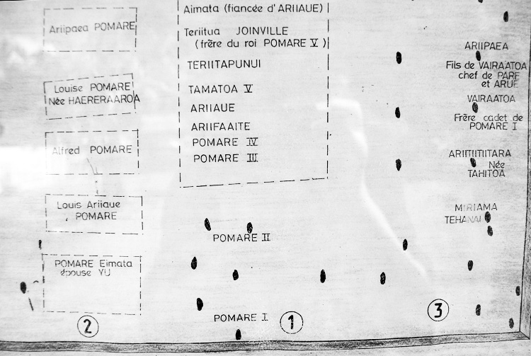
![[1]](/wiki/United_States#/media/File:USA_orthographic.svg)
![[3]](/wiki/File:Russian_map_of_Su-24_shootdown_by_Turkey.png)
- Article(s)
- Template:Location map Sri Lanka
- Module:Location map/data/Sri Lanka Northern Province
- (more modules to be created)
- Request
- Replace the topography detail of the existing relief map (2nd file), with that of the more accurate and detailed NASA map (3rd file). (recolouring will be needed)
- Sharpen the provincial and district borders with those as shown on
files 4 and 5file 6. These two files are samples only, and are to be deleted. - Fix borders on the relief map (top area - 2nd file).
- Make provincial borders thicker than district borders.
- Remove the two rivers and reservoirs from the first two maps (see also), and
- If needed, you may visit this page to test the accuracy of the country's borders. The placemark's coordinates are very accurate (taken from Google Earth), and shows the extreme ends of the country. Thanks! Rehman 06:47, 27 December 2015 (UTC)
- Anyone? Rehman 12:08, 25 February 2016 (UTC)
- Wow, it's quiet in here... Rehman 23:27, 21 March 2016 (UTC)
- I'd advise asking elsewhere for help. Topics on this page are rarely filled. Jolly Ω Janner 00:03, 22 March 2016 (UTC)
- Thanks for the reply. I'll check Commons. Rehman 05:26, 25 March 2016 (UTC)
- Requested one here. Rehman 05:33, 25 March 2016 (UTC)
- I'd advise asking elsewhere for help. Topics on this page are rarely filled. Jolly Ω Janner 00:03, 22 March 2016 (UTC)
- Wow, it's quiet in here... Rehman 23:27, 21 March 2016 (UTC)
- Anyone? Rehman 12:08, 25 February 2016 (UTC)
- Graphist opinion(s)