
Wikipedia:Graphics Lab/Map workshop
The Graphics Lab is a project to improve the graphical content of the Wikimedia projects. Requests for image improvements can be added to the workshop pages: Illustrations, Photographs and Maps. For questions or suggestions one can use the talk pages: Talk:Graphics Lab, Talk:Illustrations, Talk:Photographs and Talk:Maps.
This specific page is the requests page for the Map workshop. Anyone can make a request for a map to be created or improved for a Wikipedia article. The standard format for making a request is shown below, along with general advice, and should be followed.
You are encouraged to share information and request advice from others. Also see possible conventions toolbox, map tutorials and topographic map tutorials.
| Advice to requesters |
|---|
|
What do we do?
|


| If you have completed work and not received a reply you may use the {{GL Map reply}} template to inform the requester. |
| Map makers and other visitors to the Graphics Lab may be interested in the RSS feed of changes to this page. You may find it here. |
| See also our sister Map workshop at Commons and the WikiProject Maps |
| Result | Code | Usage |
|---|---|---|
{{resolved}} ~~~~
|
Mark a thread as resolved and request archiving | |
{{subst:bump}}
|
Delay automatic archiving of a section for 30 days | |
{{I take|~~~~}}
|
When you'll be working on the request | |
{{Done}} ~~~~
|
When the request is done |
This page is automatically archived by ClueBot III. | |
Tang dynasty, 742
-
No map currently available on wiki
-
 1st try by Yug.

Article(s): Tang Dynasty
Request: Hello graphists, I'm reading the Cambridge history of China, vol.3, and there are a really complete map of the Tang Dynasty in 742. The map is display in the page 403, and it would be interesting to use it to produce the map of the Empire area, together with the provinces borders. I found a link : on books.google.com. A map would be welcome~ Requester (talk) 12:07, 3 January 2009 (UTC)
Graphist opinion:
- Ok, I'm interested by this one. I will provide something soon. Yug (talk) 10:67, 5 January 2009 (UTC)
- What about that ? Yug (talk) 22:37, 17 January 2009 (UTC) PS: I noticed 'Requester' on his talkpage ;)
- O.O ! Great ! far better than what I expected. Thanks so much !!!! I put it into the article ! Thanks ! Requester (talk) 9:41, 21 January 2009 (UTC)
- Ok, so I tag this request as resolved. See you~ Yug (talk) 12:11, 23 January 2009 (UTC)
Seattle
-
 Sad beginnings of a Seattle map
 -
 Ideally should look something like this


Article(s): Seattle
Request: Trying to get this thing rolling, this is a request out of the archives that I'd like to see get done and just don't have never had the time to do myself. Seattle is one of our featured articles and it really ought to have a decent map to go with it. Kmusser (talk) 18:01, 27 January 2009 (UTC)
Graphist opinion:
- OpenStreetMap may also help a lot ! Yug (talk) 06:41, 10 February 2009 (UTC)
- Yes Seattle on OpenStreetMap, osmarender view, cloudmade original, cloudmade tourist, cloudmade fine line. These are all cc-by-sa licensed and can be screenshotted and uploaded to wikipedia. SVG export is also possible, but at the current time it's a bit unreliable for zoomed out whole city maps. -- Harry Wood (talk) 10:37, 25 February 2009 (UTC)
North America Geology Map

Article(s): Geology of North America and many others.
Request: Re-listing Connormah's request from the Image Lab - map probably needs to be re-done from scratch in order to look good. Kmusser (talk) 13:07, 3 February 2009 (UTC)
Graphist opinion:
Algonquin

Article(s): Algonquin
Request: Another request re-listing, originally from Connormah, map should be totally re-done. Kmusser (talk) 13:09, 3 February 2009 (UTC)
Non-Graphist questions: What is the meaning of the dotted areas? Should it show uncertainty in the distribution, movements or is the map resolved to village-level? Not being familiar with American history, did the states/provinces exist as indicated on the map around 1800? bamse (talk) 17:37, 10 February 2009 (UTC)
- Presumably it's to show the uncertainty in the distribution, it's mapping linguistic groupings which wouldn't have definite borders - and the state/prov. boundaries shown are modern. Kmusser (talk) 19:18, 11 February 2009 (UTC)
- Thanks for clarifying. I suppose at their common borders the different groups would overlap then (?) If the state/prov. boundaries are modern, they should not appear in a map from 1800 in my opinion. bamse (talk) 19:59, 11 February 2009 (UTC)
Graphist opinion:
Faisal-Weizmann
-
 Existing, incorrect, OR map
 -
 This map is to use as background for the new one.


Article(s): Currently shown on Faisal–Weizmann Agreement, British Mandate of Palestine and Churchill White Paper, as well as discussed on talk pages.
Request: Hail graphists, if only my rapidographs were of the current era, I wouldn’t need to bother you. As an appreciative and knowledgeable map user, I request that this map be corrected to reflect the RSs provided below, rather than as currently presented. (If that is possible, because Wiki’s image-related policies are unfathomable to my mind). I want to keep the map, rather than just delete it; it is very important but must be accurate.
One source for this image can be found here. This site shows the borders, as well as geographically related text (See section: The Boundaries of Palestine SCHEDULE) to technically determine the validity of a wiki-map representation. I Google’d the book source cited for the map and found an original(?) accessible one here. Being a hot topic, I checked on the R of the RS, and found this among others. I also found it here and note its apparent acceptance by consensus. I consider this book source reliable and notable for its reported apparent lack of bias. Another accessible site for a representation of the borders exists here. This second representation is similar to the book source for the map, noted above, and by comparison, better illustrates the differences with the current wiki-map.
I doubled-checked the geographically related text and found similar here (Again section: The Boundaries of Palestine SCHEDULE), but no map is provided at this site. I am unaware of other sources for the map at this time.
After looking into the geographic text and included place-names, with the aid of this map (big file but I didn't look at the bigest one), my professional-level map skills, familiarity with the spoken Arabic language and the area, I believe an NPOV correction is possible. Sidon is obvious and ‘following the watersheds’ is largely technical. JISR EL KARAON is a 1919 bridge over/on the Litani River near a village at Lake Qaraoun. EL BIRE is Al-Bireh, Lebanon, because that article includes reference to ‘Wadi el-Taym’, (Wadi ET TEIM). I have found ‘Bayt Jinn’ (BEIT JENN) in Syria on the Dec. 1989 NatGeo map, Holy Land, which also shows the Hedjaz Railway to the east. I suspect that NAHR MUGHANIYE, may be an upper tributary name of what the same map shows as Nahr al A’waj, farther downstream, because of its location and the text description. Other than this last item, I do not consider this OR, since we are talking about a map and must translate languages, alphabets and differences in spelling over time. That, however, is your bailiwick.
I hope this sufficiently explains and illustrates my concerns regarding this current map presentation. Since the current representation is only consistent on the south and west, this leads me to believe that more than a technical zoom factor or aspect ratio may be involved. Sorry to put you under the gun. I am willing to assist technically if needed, to provide insight into the very important water resource aspects noted elsewhere in the text, or scaled long/lat data from my paper maps. But, electronically speaking, I am graphically challenged. I will be checking the page, with hope. Professional Regards, CasualObserver'48 (talk) 09:52, 5 February 2009 (UTC)
- Re: Suggested base map. It might work, but I suspect that the northern border of the base map should cover farther north, so that the correct 'red line' border does not get squeezed to the edge. Looks to be a similar problem with the this one. CasualObserver'48 (talk) 11:03, 5 February 2009 (UTC)
- I volunteer to provide any assistance that I can, provided you can accept classically calculated (paper, pencil, scale, etc) input. For starters, it would require agreement on a published base map (like the one noted above (1:405,500), from which I work, and a common understanding of the data/units you require for electronic input. Agreement on what dots go where would be consensual, based on how we got there and the variability of data provided. Regards, CasualObserver'48 (talk) 05:52, 24 February 2009 (UTC)
Graphist opinion: Definitely doable, I won't get to it anytime soon though, so if anyone else wants to take this on please do. Kmusser (talk) 14:01, 5 February 2009 (UTC)
Presidential Election Map
-
Presidential voting shifts from the 2004 election to the 2008 election
-

-


Article(s): United States Presidential Election, 2008
Request: Make another map just like it so it's allowed to be put up in the article. Frightwolf (talk) 16:54, 9 February 2009 (UTC)
Graphist opinion: We'd need the original source data to make a non-free version. That's generally available on each individual county board of election web site, but I'm not about to collate them all. Kmusser (talk) 17:10, 9 February 2009 (UTC)
- http://elections.nytimes.com/2008/results/president/map.html Do you mean something like that? -- Frightwolf (talk) 19:01, 9 February 2009 (UTC)
- That's copyrighted.Kmusser (talk) 19:28, 9 February 2009 (UTC)
- I don't mean use that (that's the problem I'm having, anyway), but if the NYT is accurate, couldn't we make a similar map in the same vein? If not, then because of the sheer amount of work it would take, would it be possible to find a way to use the NYT map instead? -- Frightwolf (talk) 19:44, 9 February 2009 (UTC)
- We could make a similar map, but would need to go to the county results, ideally as reported by the counties themselves rather than the media as the media often don't bother to wait for final numbers to publish and don't usually go back to update themselves (note the lack of Alaska data, and I'd imagine MN doesn't reflect the recounts) - I also wouldn't put it past the NYT to deliberately mis-color a county as a copyright trap. Unfortunately "it would take a lot of work to replace" isn't exactly a valid fair use rationale. However, that said, since responding I did find county level results in a non-graphical format for 2008 that would be usable to create a map if we're ok with media reported numbers (bottom of http://www-personal.umich.edu/~mejn/election/2008/), if we can get the same for 2004 it might not be as hard as I initially thought. Kmusser (talk) 20:26, 9 February 2009 (UTC)
- Ah, your talk about the NYT mis-coloring a county is a great point. I believe dictionaries have made up some words and definitions as a copyright trap, as well. Good call. As far as the county results, I believe it'd definitely be useful. Do you think you and even a few other editors may be able to work on it at some point? My photo program is pretty primitive. I tried just making a state results map and it just doesn't do the job, unfortunately. -- Frightwolf (talk) 20:49, 9 February 2009 (UTC)
- I can turn a spreadsheet into a map, would just need the '04 data in a spreadsheet to map the change. Kmusser (talk) 21:24, 9 February 2009 (UTC)
- Here's something I found: http://www.usatoday.com/news/politicselections/vote2004/PresidentialByCounty.aspx?oi=P&rti=G&tf=l&sp=AZ Does this help? On the right, you just need to go President by County and select which state, and they give you a county-by-county run-down for each state. Not as great as just one spreadsheet, but a pretty good resource nonetheless. -- Frightwolf (talk) 22:23, 9 February 2009 (UTC)
- Data obtained! I'll see what I can do, if I don't have something for you today it'll be next week sometime. Kmusser (talk) 18:07, 11 February 2009 (UTC)
- Thanks! I appreciate it very much! -- Frightwolf (talk) 00:26, 12 February 2009 (UTC)
- Data obtained! I'll see what I can do, if I don't have something for you today it'll be next week sometime. Kmusser (talk) 18:07, 11 February 2009 (UTC)
- Here's something I found: http://www.usatoday.com/news/politicselections/vote2004/PresidentialByCounty.aspx?oi=P&rti=G&tf=l&sp=AZ Does this help? On the right, you just need to go President by County and select which state, and they give you a county-by-county run-down for each state. Not as great as just one spreadsheet, but a pretty good resource nonetheless. -- Frightwolf (talk) 22:23, 9 February 2009 (UTC)
- I can turn a spreadsheet into a map, would just need the '04 data in a spreadsheet to map the change. Kmusser (talk) 21:24, 9 February 2009 (UTC)
- Ah, your talk about the NYT mis-coloring a county is a great point. I believe dictionaries have made up some words and definitions as a copyright trap, as well. Good call. As far as the county results, I believe it'd definitely be useful. Do you think you and even a few other editors may be able to work on it at some point? My photo program is pretty primitive. I tried just making a state results map and it just doesn't do the job, unfortunately. -- Frightwolf (talk) 20:49, 9 February 2009 (UTC)
- We could make a similar map, but would need to go to the county results, ideally as reported by the counties themselves rather than the media as the media often don't bother to wait for final numbers to publish and don't usually go back to update themselves (note the lack of Alaska data, and I'd imagine MN doesn't reflect the recounts) - I also wouldn't put it past the NYT to deliberately mis-color a county as a copyright trap. Unfortunately "it would take a lot of work to replace" isn't exactly a valid fair use rationale. However, that said, since responding I did find county level results in a non-graphical format for 2008 that would be usable to create a map if we're ok with media reported numbers (bottom of http://www-personal.umich.edu/~mejn/election/2008/), if we can get the same for 2004 it might not be as hard as I initially thought. Kmusser (talk) 20:26, 9 February 2009 (UTC)
- I don't mean use that (that's the problem I'm having, anyway), but if the NYT is accurate, couldn't we make a similar map in the same vein? If not, then because of the sheer amount of work it would take, would it be possible to find a way to use the NYT map instead? -- Frightwolf (talk) 19:44, 9 February 2009 (UTC)
- That's copyrighted.Kmusser (talk) 19:28, 9 February 2009 (UTC)
- Done! I need some help from someone that knows SVG better to determine why Alaska and Hawaii aren't showing up (they show up fine in Inkscape) and possibly reduce the massive file size.Kmusser (talk) 15:21, 19 February 2009 (UTC)
- Don't forget to add a license tag to the image. looks nice btw. /Lokal_Profil 16:42, 19 February 2009 (UTC)
- This looks great! I really appreciate the work you put into it. I'm not too familiar with the programs to know why Hawaii and Alaska aren't showing up, but I still could put it up for now and we'll just update it when it shows up. Does that sound all right? -- Frightwolf (talk) 17:34, 19 February 2009 (UTC)
- Sure, you can go ahead and use it in the meantime.Kmusser (talk) 17:55, 19 February 2009 (UTC)
- Added png version to use until the SVG is fixed up. Kmusser (talk) 15:25, 23 February 2009 (UTC)
- This looks great! I really appreciate the work you put into it. I'm not too familiar with the programs to know why Hawaii and Alaska aren't showing up, but I still could put it up for now and we'll just update it when it shows up. Does that sound all right? -- Frightwolf (talk) 17:34, 19 February 2009 (UTC)
Early expeditions in Antarctica
-
png
-
 svg
svg

Article(s): List of Antarctic expeditions and many other
Request: As a split off of an archive request by Andeggs (and to try out the new map lab) I request a map showing the expeditions in Antarctica before the Heroic Age of Antarctic Exploration.bamse (talk) 17:22, 10 February 2009 (UTC)
Graphist opinion: I translated and modified
Expeditions in Antarctica-fr.svg which is in French. The
map is supposed to show all successful expeditions (those that discovered new land for instance) south
of 60° S latitude the Antarctic Convergence. Please check for completeness. I could not find the routes taken by the expeditions
in the box. It would be great if somebody could direct me to sources for these. At least for the Southern
Ocean Expedition there should exist such material I think. Looking for comments on completeness, correctness
and beauty. The svg-version renders terribly even though I used a supported font (DejaVu sans). How can
I fix this?bamse (talk) 17:22, 10 February 2009 (UTC)
- I think it looks good, I don't see anything I'd change other than making it more complete. I'll see if I can track down any of those missing expeditions next week, I think I have a couple of books on Antarctic exploration at home. As for getting SVG to render better, my solution is just to use PNG :-) Kmusser (talk) 17:44, 10 February 2009 (UTC)
- Thanks. Then I'll leave the svg if somebody wants to translate or change something later on. bamse (talk) 17:50, 10 February 2009 (UTC)
- I just noticed that TimesNewRoman works much better in the svg. I only changed the font in the legend so far but will update all the text later. bamse (talk) 10:51, 11 February 2009 (UTC)
- After a discussion with User:Apcbg I extended the scope to expeditions south of the Antarctic Convergence and added the expedition of Anthony de la Roché. Also changed (hopefully everywhere) to Times New Roman to get a better wiki-rendering of the svg. Still looking for routes of the expeditions in the box. bamse (talk) 21:18, 15 February 2009 (UTC)
- OK, it's going to be awhile longer before I can work more on this, in the meantime I have found some sources for you if you want to continue on your own. Most refer to the Southern Ocean and Jason expeditions by their captains, Biscoe and Larsen respectively. The Philip's Atlas of Exploration ISBN 0540061913 has maps for Bransfield, Biscoe, Balleny, Larsen, and 2 that you don't have listed, Peter Kemp (1833-4), and T.E.L. Moore (1845). The October 1932 issue of National Geographic has a great map which is also online shows Biscoe and Balleny in more detail than Philip's. It also looks like d'Urville should have a 2nd loop near the South Orkney and Shetland Islands. I couldn't find any evidence that Shelvocke should be included, his own map doesn't show anything south of Cape Horn. I noticed that the NG map indicates Bull/Borchgrevink's 1895 landing with a point, you might do the same for him, Palmer, and Davis. Kmusser (talk) 04:28, 18 February 2009 (UTC)
- Great map, thanks a lot! Also the present map should be checked for mistakes. At least the expedition of Ross (taken from the French map) sailing through the Ice shelf is wrongly indicated. Unfortunately I don't have access to Philip's Atlas. Maybe you could draw the respective routes? No need to rush with this, as I am also quite busy at the moment. bamse (talk) 09:24, 18 February 2009 (UTC)
- Yeah, when I get some time I can draw or scan in the routes from Philip's.Kmusser (talk) 14:54, 18 February 2009 (UTC)
- Great map, thanks a lot! Also the present map should be checked for mistakes. At least the expedition of Ross (taken from the French map) sailing through the Ice shelf is wrongly indicated. Unfortunately I don't have access to Philip's Atlas. Maybe you could draw the respective routes? No need to rush with this, as I am also quite busy at the moment. bamse (talk) 09:24, 18 February 2009 (UTC)
- OK, it's going to be awhile longer before I can work more on this, in the meantime I have found some sources for you if you want to continue on your own. Most refer to the Southern Ocean and Jason expeditions by their captains, Biscoe and Larsen respectively. The Philip's Atlas of Exploration ISBN 0540061913 has maps for Bransfield, Biscoe, Balleny, Larsen, and 2 that you don't have listed, Peter Kemp (1833-4), and T.E.L. Moore (1845). The October 1932 issue of National Geographic has a great map which is also online shows Biscoe and Balleny in more detail than Philip's. It also looks like d'Urville should have a 2nd loop near the South Orkney and Shetland Islands. I couldn't find any evidence that Shelvocke should be included, his own map doesn't show anything south of Cape Horn. I noticed that the NG map indicates Bull/Borchgrevink's 1895 landing with a point, you might do the same for him, Palmer, and Davis. Kmusser (talk) 04:28, 18 February 2009 (UTC)
- I think it looks good, I don't see anything I'd change other than making it more complete. I'll see if I can track down any of those missing expeditions next week, I think I have a couple of books on Antarctic exploration at home. As for getting SVG to render better, my solution is just to use PNG :-) Kmusser (talk) 17:44, 10 February 2009 (UTC)
Afghanistan maps
-
Afghanistan's ethnic groups
-
 Afghanistan's languages
 -
 Security Map of Afghanistan
 -
 SVG map
 -
 Afghanistan's ethnic groups (SVG)PashtunTajikHazaraUzbekTurkmenNuristaniBalochPashai
 -
 Afghanistan's languages (SVG)Persian (Dari)PashtoUzbekiTurkmeniNuristaniBalochiPashai
_in_Afghanistan.jpg?lang=en)


Article(s): Afghanistan; Demography of Afghanistan
Request: Basically, I want these 3 maps to look more "professional" and cleaned up. All three are sourced. Additional maps, such as this one or this one, can be used as a help. Thank you. If you need any further sources, please let me know. Tājik (talk) 02:12, 19 February 2009 (UTC)
Graphist opinion:
- The first step would be to do a SVG version of the districts map. I'll try to create one from [2] which should be a free (commons:template:PD-MapLibrary) source for reliable vector data. /Lokal_Profil 20:56, 19 February 2009 (UTC)
- Yes, that's great. Thank you very much. Tājik (talk) 21:09, 19 February 2009 (UTC)
- Drat. After having converted it and getting ready to upload it I discovered that this particular map comes from another source and isn't PD. Have now updated PD-MapLibrary to make others aware of this. To bad but at least Africa maps and Central America maps are free. /Lokal_Profil 21:32, 19 February 2009 (UTC)
- Sent them an e-mail about a possible change from cc-by-nc-sa to cc-by-sa but I wouldn't keep any hopes up. /Lokal_Profil 21:49, 19 February 2009 (UTC)
- Hmmm ... thank you anyway. Is there any other way? Tājik (talk) 22:21, 19 February 2009 (UTC)
- There is File:Afghanistan districts.png on commons which might make a suitable basemap.Kmusser (talk) 02:43, 20 February 2009 (UTC)
- Is the data from MapInfo Professional (which is proprietary) is that just a program for combining different data? BTW. got an out of office reply to the e-mail so any answer would be deleayed until next week. /Lokal_Profil 19:52, 21 February 2009 (UTC)
- Yes, MapInfo is just the software, not the data source - though User:Rarelibra doesn't give his data source, public domain sources for administrative boundaries aren't hard to come by, so I don't have reason to doubt the PD claim. Kmusser (talk) 01:28, 22 February 2009 (UTC)
- Is the data from MapInfo Professional (which is proprietary) is that just a program for combining different data? BTW. got an out of office reply to the e-mail so any answer would be deleayed until next week. /Lokal_Profil 19:52, 21 February 2009 (UTC)
- Sent them an e-mail about a possible change from cc-by-nc-sa to cc-by-sa but I wouldn't keep any hopes up. /Lokal_Profil 21:49, 19 February 2009 (UTC)
- Drat. After having converted it and getting ready to upload it I discovered that this particular map comes from another source and isn't PD. Have now updated PD-MapLibrary to make others aware of this. To bad but at least Africa maps and Central America maps are free. /Lokal_Profil 21:32, 19 February 2009 (UTC)
- Yes, that's great. Thank you very much. Tājik (talk) 21:09, 19 February 2009 (UTC)
- Ok. The Afghanistan map I created might be free anyway. since the data originally comes from USGS. I'll just doublecheck to make sure. /Lokal_Profil 16:59, 24 February 2009 (UTC)
- Thank you very much for your efforts. How long - do you think - will it take to finish the maps? :-) Tājik (talk) 13:52, 25 February 2009 (UTC)
- Once the svg basis is cleared it shouldn't take long. I'll upload the svg basis but hold on a few days in case I get a reply on my e-mails. /Lokal_Profil 19:26, 25 February 2009 (UTC)
- Almost done with ethnicity map. Only problem is that the png map Includes a district which in the svg is two districts. I'll need to investigate which is right. /Lokal_Profil 15:44, 1 March 2009 (UTC)
- Ethnicity map done. I've however discovered that the districts in the svg map aren't the most up to date... not much one can do though. /Lokal_Profil
- Language map done. /Lokal_Profil 18:54, 1 March 2009 (UTC)
- Won't be able to do the security map since text boxes cover some of the districts. /Lokal_Profil 18:58, 1 March 2009 (UTC)
- Language map done. /Lokal_Profil 18:54, 1 March 2009 (UTC)
- Thank you! The maps look good. Do not worry about the security map. Do you think you can insert a legend into the maps? Explaining the colors? That would be great! Tājik (talk) 13:35, 2 March 2009 (UTC)
- Lokal put a legend in the image description, it's usually better to copy the legend into the caption on the page that you're going to use the map and keep the map itself language independent, see United Nations Regional Groups as an example in use. Kmusser (talk) 13:59, 2 March 2009 (UTC)
- That sounds good. Thank you. Tājik (talk) 14:06, 2 March 2009 (UTC)
- Hi, I discovered a small mistake in the map regarding ethnic groups. Two districts that are Tajik and Hazara in majority are shown as Pashtun. You see them by comparing the new map with the old one. It's in the Ghazni area. Tājik (talk) 20:13, 2 March 2009 (UTC)
- I know. The problem is that whilst they are two districts in the png map they are one district in the svg. Apparently there has been quite a lot of reorganisation in that area so I extrapolated the colour based on Ghazni_Province#Demographics_and_geography. Interestingly enough it was neither of the colours in the png which dominated. /Lokal_Profil 01:30, 3 March 2009 (UTC)
- OK, fair enough. That's a good explanation, and it should not be such a big problem. Just one last point: Hazara is spelled with a "z" only, not with "zh". ;-) But thank you very much, anyway! Tājik (talk) 03:14, 3 March 2009 (UTC)
- Additional corrections: indeed, both former districts (Jaghatu and Bahrami Shahid) were put together to form the new district "Jaghatu". According to official numbers from Afghanistan, Hazaras are 73% of this new district (see also this official PDF). So, the color of that district should be yellow. Tājik (talk) 03:34, 3 March 2009 (UTC)
- Thanks. Map and legends have been updated. It seems as though there has been a lot of admin changes in that area since (according to Ghazni_Province that disterict no longer exists. That's not a problem for this map though. /Lokal_Profil 22:13, 3 March 2009 (UTC)
- Thank you man. Now everything is fine. I will copy the maps into the relevant articles. Take care. Tājik (talk) 23:10, 3 March 2009 (UTC)
- You're welcome. Taggged as resolved /Lokal_Profil 16:17, 4 March 2009 (UTC)
- I know. The problem is that whilst they are two districts in the png map they are one district in the svg. Apparently there has been quite a lot of reorganisation in that area so I extrapolated the colour based on Ghazni_Province#Demographics_and_geography. Interestingly enough it was neither of the colours in the png which dominated. /Lokal_Profil 01:30, 3 March 2009 (UTC)
- Lokal put a legend in the image description, it's usually better to copy the legend into the caption on the page that you're going to use the map and keep the map itself language independent, see United Nations Regional Groups as an example in use. Kmusser (talk) 13:59, 2 March 2009 (UTC)
- Ethnicity map done. I've however discovered that the districts in the svg map aren't the most up to date... not much one can do though. /Lokal_Profil
- Almost done with ethnicity map. Only problem is that the png map Includes a district which in the svg is two districts. I'll need to investigate which is right. /Lokal_Profil 15:44, 1 March 2009 (UTC)
- Once the svg basis is cleared it shouldn't take long. I'll upload the svg basis but hold on a few days in case I get a reply on my e-mails. /Lokal_Profil 19:26, 25 February 2009 (UTC)
- Thank you very much for your efforts. How long - do you think - will it take to finish the maps? :-) Tājik (talk) 13:52, 25 February 2009 (UTC)
Map to SVG
-
PNG
-
 SVG
SVG

Article(s): List of countries by motor vehicle production Retrieved from "http://en.wikipedia.org/wiki/File:Autoproduction2.PNG"]]
Request: Make into SVG please. Also, remove the unnecessary flags. ZooFari 00:18, 21 February 2009 (UTC)
Graphist opinion:
- I'll give this a shot. /Lokal_Profil 19:53, 21 February 2009 (UTC)
- Done. Is it ok? /Lokal_Profil 20:47, 21 February 2009 (UTC)
- Also created maps for 2005 and 2000. /Lokal_Profil 20:57, 21 February 2009 (UTC)
- Done. Is it ok? /Lokal_Profil 20:47, 21 February 2009 (UTC)
- Thank you, I have updated the article and added the 2005/2000 as well. Thanks again! ZooFari 02:41, 24 February 2009 (UTC)
Union of Russia and Belarus

Article(s): Union State
Request: Wikify map-white oceans, grey land in non-relevant areas... Chris (クリス • フィッチュ) (talk) 09:45, 16 February 2009 (UTC)
Graphist opinion:
- The recommended Wikipedia map colours are here. It looks to me like this map, and all it's sister works are already in the proper style. Inductiveload (talk) 11:15, 16 February 2009 (UTC)
Pacific blank wiki map this projection

Article(s):
Request: blank wiki map this projection... Chris (クリス • フィッチュ) (talk) 05:27, 18 February 2009 (UTC)
Graphist opinion:
- Please clarify projection. Are you referring to this particular Map projection? I presume you're wanting a SVG map of the pacific region. Is the previous SVG map of the ring of fire the wrong projection? —Preceding unsigned comment added by 202.154.152.34 (talk) 10:53, 18 February 2009 (UTC)
- Is that what you meant? − Inductiveload (talk) 21:13, 18 February 2009 (UTC)
- Ah, no, I meant where Alaska is shaped normally and not squashy, referring to this particular Map projection. Chris (クリス • フィッチュ) (talk) 16:04, 19 February 2009 (UTC)
- Okay, I've worked out how to do a mercator projection (like what google maps does) with [my script], but I don't like what that does to the sizes of countries. I'll have a hunt for a good equal-area projection. Because this is not the entire globe, shape distortion around the edges shouldn't matter so much. gringer (talk) 11:36, 25 February 2009 (UTC)
- Perhaps try Winkel tripel projection? Kmusser (talk) 14:12, 25 February 2009 (UTC)
- That'll probably do. It's not the entire globe, but does cover quite a chunk at the top. Here's an outline-only non-cleaned [high resolution version] (needs paths XORed, colours, etc). I'll upload a cleaned version of that to commons sometime in the next few days. gringer (talk) 11:29, 26 February 2009 (UTC)
- Perhaps try Winkel tripel projection? Kmusser (talk) 14:12, 25 February 2009 (UTC)
- I've updated that pacific map to a Winkel Tripel projection, which should be a better projection. gringer (talk) 03:01, 28 February 2009 (UTC)
- Okay, I've worked out how to do a mercator projection (like what google maps does) with [my script], but I don't like what that does to the sizes of countries. I'll have a hunt for a good equal-area projection. Because this is not the entire globe, shape distortion around the edges shouldn't matter so much. gringer (talk) 11:36, 25 February 2009 (UTC)
- If you're doing colors, can you also do a grey-and-white Wiki-style one as well? Thanks! Chris (クリス • フィッチュ) (talk) 17:38, 26 February 2009 (UTC)
- Okay, guys, I appreciate your hard work, but it is totally not what I am asking for, though the work you've done will also be useful on the Wikipedia, and thank you for that. You see the first map, File:Pacific Ring of Fire.png and how the continents and everything have very definite shapes? That's a particular projection, and unfortunately I do not know its name, but that is what I need, in grey-and-white Wiki-style. Chris (クリス • フィッチュ) (talk) 07:40, 28 February 2009 (UTC)
- That's pretty vague. That Ring of Fire map appears to be in a Mercator projection, if you wanted a gray and white Pacific Mercator map there was already one sitting on Commons. Kmusser (talk) 12:25, 28 February 2009 (UTC)
- Okay, guys, I appreciate your hard work, but it is totally not what I am asking for, though the work you've done will also be useful on the Wikipedia, and thank you for that. You see the first map, File:Pacific Ring of Fire.png and how the continents and everything have very definite shapes? That's a particular projection, and unfortunately I do not know its name, but that is what I need, in grey-and-white Wiki-style. Chris (クリス • フィッチュ) (talk) 07:40, 28 February 2009 (UTC)
- That's what I needed, couldn't find one when I searched, thank you! Chris (クリス • フィッチュ) (talk) 20:56, 28 February 2009 (UTC)
- ah, wait, okay, that one, but can we get it with white national borders, make the lakes clear (right now they are grey like countries) and increase the visible size of the svg? Chris (クリス • フィッチュ) (talk) 21:50, 28 February 2009 (UTC)
Waterways in Europe
-
 Version 1

Article(s): Waterway
Request: Wikipedia lacks a good map of the main European waterways (canals and navigable rivers), at least of large and medium size. The most reliable source of data that I have found is :
Baronnet (talk) 07:18, 24 February 2009 (UTC)
- The request has also been posted on French (Wikipédia:Atelier graphique/Cartes) and German (Wikipedia:Kartenwerkstatt/Kartenwünsche) Wikipedias, but has not yet been answered on either. Baronnet (talk) 08:02, 25 February 2009 (UTC)
Graphist opinion: OKay, I'm from the Russian Graphic Land and I'll try making this one for you, though it will take some time. Also what exactly do you want it to be? Should it be just a schematic presentation (like the pdf version) of rivers or detailed (each river traced?) In what language, or you want it just plain? --Ahnode (talk) 10:30, 8 March 2009 (UTC)
- Great news! Well, I think the best answer is: what is most convenient for you. A schematic presentation would be enough, except if a detailed map is easier. About the language, a blank map would be preferable at first. Then several language versions could be created from it. Thanks for undertaking this task. Baronnet (talk) 08:17, 13 March 2009 (UTC)
- Hello Baronnet, I started making the scheme and I'd like you to take a look at what has already been done. Do you have any comment or suggestions? Also if it is possible, could you find information on rivers for those parts of Europe that were left out on the map (Dnieper for example, a major river) and several other rivers on Russia's European territory? I would like to include that information as well, but I don't know where to look. --Ahnode (talk) 18:24, 14 March 2009 (UTC)
- This is a good start ! Thank you very much for the work you have put into this. I am very sorry: I do not have information about Russian waterways unfortunately. But probably some other Wikipedian will have. I suggest that from now on we continue the discussion about this map on the discussion page of the Wikimedia Commons file. Baronnet (talk) 09:44, 16 March 2009 (UTC)
- Hello Baronnet, I started making the scheme and I'd like you to take a look at what has already been done. Do you have any comment or suggestions? Also if it is possible, could you find information on rivers for those parts of Europe that were left out on the map (Dnieper for example, a major river) and several other rivers on Russia's European territory? I would like to include that information as well, but I don't know where to look. --Ahnode (talk) 18:24, 14 March 2009 (UTC)
City limits map to SVG
-
 Map displaying settlements of Zaprešić and city limits of the city and surrounding municipalities
 -
 SVG version


Article(s): Zaprešić
Request: Although I'm proud of my fiddling with Photoshop and scans of existing maps, I'm planning to have the article where this map appears featured and I'd like it to look as professional as possible. Since I currently can't modify the map to accord to our mapping guidelines (yellow on orange background, etc.; the kind of a map you usually see on high-profile articles) without losing much information about the borders in the process, and I really suck at SVGs, I'm asking someone to do the job for me. Hopefully, it shouldn't be too hard. Admiral Norton (talk) 23:11, 25 February 2009 (UTC)
Graphist opinion:
I can do a quick trace of it, but I can't promise the borders will be 100% the same. It's tricky tracing lines that squiggle all over and the convert to SVG tool in Inkscape is worthless. vıdıoman 23:54, 25 February 2009 (UTC)
- That's not an issue for me, I understand it can't be done perfectly given software and human limitations and I don't expect it to be pristine. BTW, the thick border down right is a county border and I believe it should be emphasized somehow (you don't have to make it that way if the regulations say otherwise, I don't know them). Admiral Norton (talk) 17:52, 26 February 2009 (UTC)
- We have guidelines for various border types. I can't do it tonight (no time) but I can get to it tomorrow or Sunday. vıdıoman 00:58, 27 February 2009 (UTC)
- Two things: The top left had a large brown area, I interpreted that as a county division and drew it as such but if it is wrong I can correct it. Also, I made the land on the other side of county borders grey so that Zagreb county could be orange, allowing Zaprešić to be yellow. If you think the other counties should just be orange let me know. Also let me know if the numbers appear properly (aren't overlapping boundaries or each other). vıdıoman 02:20, 1 March 2009 (UTC)
Topography

Article(s): Bosnia-Herzegovina
Request: Zoom and dim the regions that are not Bosnia-Herzegovina, it should look similar to [3]. PRODUCER (talk) 19:17, 20 February 2009 (UTC)
Graphist opinion:
Sarajevo municipalities

Article(s): Sarajevo
Request: Update the map to make it more modern like [4], highlight rather than dim the four municipalities, and number the 4 municipalities. PRODUCER (talk) 18:19, 21 February 2009 (UTC)
Graphist opinion:
Somalia map

.svg?lang=en)
Article(s): Somalia
Request: remove shading on wording, somehow make more legible... Chris (クリス • フィッチ) (talk) 08:37, 2 February 2009 (UTC)
Graphist opinion:
- On it, but this will take a while. Inductiveload (talk) 10:54, 3 February 2009 (UTC)
- Ok, I've got a far as a good map of Somalia, with all the borders that are on that diagram. However I am not sure what borders are which (state, region, district), and they don't always seem to align to the borders on other maps (there are several regions which are named but I can't see in the WP articles. Since Somalia is in such turmoil, I don't know what goes where. Somone up-to-date with the sistuation/history would be better than me. I have also put a very few minor and major settlements on (they're in a hidden layer of the SVG currently), but I don't think it is useful to show these if this is intended to show the political situation rather than geography. Rivers are included, but roads are not. The image is also included in the SVG as a hidden layer, to make it easy to trace stuff on top. When this is all finished, that can be taken out. Inductiveload (talk) 13:01, 3 February 2009 (UTC)
- Wow you're fast, and good with fine details! I like the color scheme you've chosen better, as well. Chris (クリス • フィッチュ) (talk) 13:45, 3 February 2009 (UTC)
- I've changed the colours to match the "standard" maps you see on WP, and added some cities and stuff. I'm going to leave it there for now, but the image is still in a hidden layer for reference. Ideally, this will be the map that is used for making future maps of the Somalia situation, as it should be relatively easy to change the boundaries. Also, the Wikimedia SVG engine seems to be struggling to render the text nicely at lower resolution. Inductiveload (talk) 14:54, 3 February 2009 (UTC)
- The text problem can be fixed by simply converting the text objects to path objects: in Inkscape, simply select all the text objects, then go Path -> Object to Path. The text objects are now path objects, which MediaWiki's SVG engine renders nicely, but beware: always backup the previous version of the image (with the text as text objects) so that you can change the text later if need be.
- I've changed the colours to match the "standard" maps you see on WP, and added some cities and stuff. I'm going to leave it there for now, but the image is still in a hidden layer for reference. Ideally, this will be the map that is used for making future maps of the Somalia situation, as it should be relatively easy to change the boundaries. Also, the Wikimedia SVG engine seems to be struggling to render the text nicely at lower resolution. Inductiveload (talk) 14:54, 3 February 2009 (UTC)
- Anyways, I can very well fix the text for you if you want, but please make sure no further text edits are performed, to make it easy on all of us.
- --[|Retro00064 | (talk/contribs) |] 07:08, 14 February 2009 (UTC)
- I don't understand any of that, but please, go ahead! Chris (クリス • フィッチュ) (talk) 08:51, 14 February 2009 (UTC)
- I know that, but I don't like doing it, as it means that no-one can ever edit the text again, and it makes the file size huge. I think it's better to leave it in and wait or the mediawiki renderer to improve! − Inductiveload (talk) 12:58, 14 February 2009 (UTC)
- Yes, it does increase the file size. But, as far as editing the text, that's why I saaid to back up the image! You can also use the old version saved in the "File history" section on the image description page. [|Retro00064 | (talk/contribs) |] 07:37, 15 February 2009 (UTC)
- I have a similar problem with text-rendering in File:Expeditions in Antarctica before 1897.svg. The DejaVusans font I used first looked horribly as rendered by wikipedia. I now changed it to TimesNewRoman, which renders better, though I would prefer other fonts for maps. Maybe you can avoid converting text to paths by just changing to a different font. Another option would be to upload a png version of the map and link it in the image description to the svg for translation/modification purposes. bamse (talk) 21:28, 15 February 2009 (UTC)
- Yes, it does increase the file size. But, as far as editing the text, that's why I saaid to back up the image! You can also use the old version saved in the "File history" section on the image description page. [|Retro00064 | (talk/contribs) |] 07:37, 15 February 2009 (UTC)
- I know that, but I don't like doing it, as it means that no-one can ever edit the text again, and it makes the file size huge. I think it's better to leave it in and wait or the mediawiki renderer to improve! − Inductiveload (talk) 12:58, 14 February 2009 (UTC)
- One thing you can do in this situation is to convert texts to paths only in the final version, leaving a comment something like 'text converted to paths, use previous version for editing'. Then each revision needs two uploads (one for text version, one for converted paths), but it reduces the hassle of editing. gringer (talk) 00:03, 16 February 2009 (UTC)
Pacific Ring of Fire volcanoes
-
Original PNG Map of the RoF & Mts. Mayon, Krakatau, St. Helens, Pinatubo, and Garibaldi
-
 this could be used as a clearer base map
 -
 base SVG image, created using WDB data


Article(s): Pacific Ring of Fire
Request: Convert into SVG and fine-tune it, please. -BlueCaper (talk) 18:48, 4 February 2009 (UTC)
Graphist opinion:
- I've made a base image, using WDB data with a resolution of 1 degree. It needs text and fault lines added. gringer (talk) 23:57, 10 February 2009 (UTC)
- Added labels and stuff. Inductiveload (talk) 17:19, 11 February 2009 (UTC)
- OK, added volcanos. Is that done? − Inductiveload (talk) 23:24, 13 February 2009 (UTC)
- The volcanoes are misplaced on the original map, most dramatically with Mt. Mayon which is in the Philippines, the articles on the individual volcanoes have correct coordinates for them. Kmusser (talk) 17:22, 19 February 2009 (UTC)
- I think I've fixed the volcanoes, this should be done now. Kmusser (talk) 19:26, 3 March 2009 (UTC)
- The volcanoes are misplaced on the original map, most dramatically with Mt. Mayon which is in the Philippines, the articles on the individual volcanoes have correct coordinates for them. Kmusser (talk) 17:22, 19 February 2009 (UTC)
South Korea map
-

-
 How about this map?
Article(s): {{WikiProject Korea}}
Request: This should be fairly straightforward. What I need is a version of the above map which makes South Korea (the light green bits) more visible when reduced to that size. I'm not too fussy on how it's done; if it's any help, maps like this have areas highlighted in pink, or another option would be to use colours similar to this map. Thanks in advance! PC78 (talk) 02:27, 9 February 2009 (UTC)
Graphist opinion: Does the location map work for you? On such a small size you won't see much detail anyway. Where do you need such a tiny map?bamse (talk) 11:03, 9 February 2009 (UTC)
- Actually that's not bad (must have missed that one). I need it for the project banner, as an icon for the South Korean geography work group. PC78 (talk) 11:29, 9 February 2009 (UTC)
Orthographic maps
-
 Location of Iran
 -
 Location of Turkey
 -
 Poland here in dark red


Article(s): Potential Great Powers, possibly Iran, Turkey, and Poland pages also.
Request: Can you make them into orthographic maps (if possible). I'm planning to create a page called Potential Great Powers, and I'm trying to get all the basics down on my page that you'll see by clicking my link before I create the page. If you can, thanks. Deavenger (talk) 02:00, 11 February 2009 (UTC)
Graphist opinion:
Area code 385/801 overlay

Article(s): Area codes 385 and 801
Request: I need a map that outlines the area code overlay of 385 and 801. A map is located here CL — 00:43, 2 March 2009 (UTC)
Graphist opinion: How does this look? Kmusser (talk) 19:53, 3 March 2009 (UTC)
- That's great! Perhaps just add 385/801 and 435 labels in the appropriate areas and that'll be it. Thanks - CL — 22:29, 3 March 2009 (UTC)
- I think you're better off labeling it in the caption like you have it in the article. I just tried adding labels and it ends up looking like I'm labeling a specific county rather than the red vs white areas. Kmusser (talk) 15:29, 4 March 2009 (UTC)
Loihi Map
-
Loihi Seamount relative to Hawaii
-
 This SVG may help.
 -
 Highlighting Loihi


Article(s): Loihi
Request: SVGify ResMar 00:28, 3 March 2009 (UTC)
Graphist opinion: Is just highlighting it on the topographic map good enough? Example added. Kmusser (talk) 22:14, 3 March 2009 (UTC)
- Looks very nice to me, but User:Resident_Mario should decide. Something went wrong with the legend in the process of translation. bamse (talk) 22:32, 3 March 2009 (UTC)
- Legend fixed. Kmusser (talk) 22:51, 3 March 2009 (UTC)
- Awesomness- MUCH better then the GIF. One thing though. At 300px (standard map infobox size), the blue triangle is hardly visible. Can you increase the size of the blue "volcano" icon and the text around it? Then you could remove the ugly red O. Hope I'm not asking too much :). Cheers, ResMar 22:06, 4 March 2009 (UTC)
- Done. It's still kind of small when thumbnailed, but definitely visible - if I increase it much more it'll obscure the bathymetry that shows Loihi's oblong shape. Kmusser (talk) 16:20, 5 March 2009 (UTC)
- Thank you very much. The point of the map is not to show its bathemetrics, but to allow a user to locate it. For bathymetrics, there is other things. Amazing map! Cheers, ResMar 22:46, 5 March 2009 (UTC)
- Done. It's still kind of small when thumbnailed, but definitely visible - if I increase it much more it'll obscure the bathymetry that shows Loihi's oblong shape. Kmusser (talk) 16:20, 5 March 2009 (UTC)
- Awesomness- MUCH better then the GIF. One thing though. At 300px (standard map infobox size), the blue triangle is hardly visible. Can you increase the size of the blue "volcano" icon and the text around it? Then you could remove the ugly red O. Hope I'm not asking too much :). Cheers, ResMar 22:06, 4 March 2009 (UTC)
- Legend fixed. Kmusser (talk) 22:51, 3 March 2009 (UTC)
-
Description of map
Article(s): Eleanor cross
Request: Show the 12 locations, joined by a line showing the journey, on a map of either medieval or modern (but not too complicated) England, cut to the relevant area of the country. Johnbod (talk) 13:57, 6 March 2009 (UTC)
Graphist opinion:
-
 The liberty chowk/roundabout is the place where attack took place.The black/gray route is of the Team convoy and Blue is the route which terrorist used to run away.

Article(s): 2009 Lahore attack on Sri Lankan cricket team
Request: Improve the route and place a star at liberty chock User:Yousaf465 (talk) 10:03, 8 March 2009 (UTC)
Graphist opinion:
Districts of Karakalpakstan
-
 Districts of Karakalpakstan

Article(s): Districts of Uzbekistan
Request: Please correct district boundaries according this map. Note that Bo’zotov (III) and Kegeyli (IV) district was merged into one district in 2004.Anatoliy (Talk) 13:56, 8 March 2009 (UTC)
Graphist opinion: We'd need a higher resolution source image, that one isn't good enough to digitize from, I can't make out the boundaries on it. I did a quick look to see if I could find GIS data for the district boundaries but came up empty. Kmusser (talk) 19:52, 17 March 2009 (UTC)
SVG blank cartogram of world countries by population
-
 Blank map of world in equirectangular projection
 -
 Same map, filled in with countries colored as to percentage of population using fluoridated water
 -
 Compact blank map, without Antarctica
 -
 Same map, with countries filled in according to per-capita calorie consumption, 2001–2003
 -
 Likewise, but for 1979–1981


Article(s): Water fluoridation, Obesity, Dietary energy supply
Request: This is a common problem. I have a map in which each country is colored according to the percentage of population that has some property. In the first colored example, it's the percentage of population that is using fluoridated water; in the second and third colored examples, it's per-capita calorie consumptions in different years.
In these maps, I want the countries' areas to be proportional to their populations, since I'm displaying information that is per-capita, and I want the overall display to have the right global focus (China's huge population, for example, should be weighted heavily, whereas Canada's relatively-small population should not consume much space on the screen). I would like a blank SVG cartogram of the world, which looks like blank maps in the galleries above, except that the countries have been stretched so that their areas are proportional to (say) the U.N. estimates for 2009 populations. You can see (copyrighted) examples of such cartograms elsewhere,[5][6] but they aren't blank and they aren't SVG format and they aren't freely usable in Wikipedia. If I had a blank SVG world-population cartogram, I could easily color it in myself and then generate colored cartograms instead of these problematic colored maps. Eubulides (talk) 06:01, 9 March 2009 (UTC)
Graphist opinion: Cartograms are very difficult to make, it might to worth asking the worldmapper folks if they'd give us permission to use theirs. Kmusser (talk) 13:07, 9 March 2009 (UTC)
- Considering that they've picked cc-by-nc-nd I don't think they would agree to a more free license. Personally I'm not a big fan of these maps for the simple reason that they don't tell me anything at a first glance but that's beside the point. There are some skilled programmers mentioned on commons:File_talk:BlankMap-World6.svg who might enjoy the challenge of turning the free File:BlankMap-World6.svg into a cartogram. If nothing else it would be very useful for illustrating how such a representation would look compared to a "normal" one. /Lokal_Profil 18:24, 9 March 2009 (UTC)
- Found File:Sweden.population.2008-11-01.cart.svg which has been created based on a Commons svg. Asked the creator to frop by the discussion here. /Lokal_Profil 18:33, 9 March 2009 (UTC)
- User said he'd give it a try but makes no promises and asks for patience. /Lokal_Profil 16:40, 11 March 2009 (UTC)
- Found File:Sweden.population.2008-11-01.cart.svg which has been created based on a Commons svg. Asked the creator to frop by the discussion here. /Lokal_Profil 18:33, 9 March 2009 (UTC)
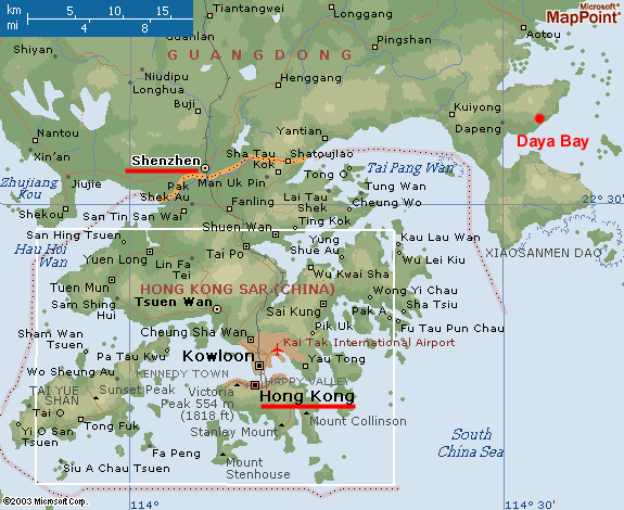
Map of Dapeng Peninsula

Article(s): Dapeng Peninsula
Request: Do something with them/Create according to the provided sources a map of the peninsula Helanhuaren (talk) 09:55, 11 March 2009 (UTC)
Graphist opinion: Did up a quick map, hopefully that works. Kmusser (talk) 17:51, 18 March 2009 (UTC)
Battle maps for Bunker Hill
-
 Bunker Hill attack map 1
 -
 Bunker Hill attack map 2
 -
 Bunker Hill attack map 3


Article(s): Battle of Bunker Hill
Request: I would like to have SVG versions of maps similar to these (or maps that at least look better when scaled down). The text on the images is not all needed, and I may want have some of it changed (e.g. to better label the force movements), or have other text (e.g. ship names and force commanders) added. There is also some data from a map in Robert Ketchum's Decisive Day that I would like to bring in (primarily detail on force locations and the nature of the American defenses), as well as some from historic maps providing better ship locations. Thanks for your help! Magic♪piano 01:22, 14 March 2009 (UTC)
Graphist opinion:
SFOBB Map
-
 Current PNG
 -
 (SVG in German)
 -
 SVG in English


Article(s): San Francisco – Oakland Bay Bridge
Request: Could someone make this PNG an SVG? Thanks in advance, SpencerT♦Nominate! 14:59, 16 March 2009 (UTC)
Graphist opinion: The image description of the German svg says: Please do not use this SVG graphic within Wikipedia articles! Use the enclosed PNG version instead. This SVG file is solely a source for re-utilization, editing or printing purposes. Why do you need an SVG version of the very good png map? Did you contact the mapmaker Alexrk, who should already have an English vector version on his harddisk? bamse (talk) 00:32, 17 March 2009 (UTC)
SVG version already exists, the linked SVG file has both English and German layers and is the source for the PNG - if there is a mistake in the PNG make the correction in the SVG file and output a new PNG file for display purposes, otherwise I don't see anything to do here. Kmusser (talk) 20:12, 17 March 2009 (UTC)
- I made three changes, but in the PNG: A miles/km (both) scale is there, the "proposed" eastern span replacement is no longer proposed so that needs to be removed. In addition, the dashed lines for the eastern span should be made solid. See Wikipedia:Featured picture candidates/San Francisco-Oakland Bay Bridge for related discussion about this. I have not contacted Alexrk, and will do so now. SpencerT♦Nominate! 00:42, 18 March 2009 (UTC)
- I don't know how to work with SVGs, so I came here for assistance. Thanks, SpencerT♦Nominate! 00:42, 18 March 2009 (UTC)
- OK, I applied the corrections you made to the PNG version to the SVG version as well. Kmusser (talk) 15:07, 18 March 2009 (UTC)
- I have uploaded the English layer of the SVG as a separate file, as File:SFOBB map en.svg. However, the English layer still has some issues that were corrected in the German layer: Broken fonts in the highway shields, the Oakland label not centered, and a missing "Francisco". Could you correct these, please? Thanks, SpencerT♦Nominate! 19:44, 18 March 2009 (UTC)
- It's better I think. The highway shields I moved to a language independent layer, figure there's no reason to have multiples of those. I don't know why Oakland kept getting displaced, but hopefully I moved it far enough over that it'll stay in the map. Kmusser (talk) 14:51, 19 March 2009 (UTC)
- I have uploaded the English layer of the SVG as a separate file, as File:SFOBB map en.svg. However, the English layer still has some issues that were corrected in the German layer: Broken fonts in the highway shields, the Oakland label not centered, and a missing "Francisco". Could you correct these, please? Thanks, SpencerT♦Nominate! 19:44, 18 March 2009 (UTC)
- OK, I applied the corrections you made to the PNG version to the SVG version as well. Kmusser (talk) 15:07, 18 March 2009 (UTC)
World map w/ UK split up
I originally posted this at Wikipedia talk:WikiProject Maps and they told me to come here, so I'm just going to copy what I wrote there:
I was looking at various images regarding international football, and I discovered that while some of the images used (such as File:World Map FIFA.svg and File:Qualifying countries of 2002 FIFA World Cup.svg were in SVG format, neither of them respected the Home Nations' borders as they should. While the PNG images that exist do the same, as they are based on File:BlankMap-World-UK.png, which does should the borders correctly. Is there any effort to create an SVG version of this image, or modify the existing SVG world map to show the borders? I started trying to do it myself, but I felt like I was taking a hacksaw to it when it required much more precision than I could offer. Also, am I even asking this in the right place?
--iTocapa iChat 19:47, 18 March 2009 (UTC)
Soviet Ukraine maps
-
Ukrainian SSR in early 1939, after the Peace of Riga and the consolidation of USSR. (see also animated version with administrative divisions [1])
-
 Ukrainian SSR in 1940. This should be broken down into two maps. 1) Soviet Ukraine after the annexation of Polish Galicia and Volhynia. 2) Soviet Ukraine after the annexation Romanian Bukovina and Bessarabia
 -
 A map of Ukraine after WWII and the Paris Peace Treaties, 1947
 -
 Ukraine after the Crimean transfer
 -
 A map outlining all gained territories at once
 -
The end result of each map should look something like this (this map is unrelated, and from 1920)

.png?lang=en)


Article(s): Ukrainian Soviet Socialist Republic
Request: There are currently several different maps illustrating the territorial progression of Soviet Ukraine. Some are animated, others are scanned atlases, so all in all these images just look bad. But more importantly, they don't specifically show the gained territory in each time frame. Would it be possible to create a similar line maps to illustrate these changes properly? The prefered order would be:
- Prewar (early 1939)
- Annexation of Polish Galicia and Volhynia (late 1939)
- Annexation Romanian Bukovina and Bessarabia
- After WWII and the Paris Peace Treaties (1947)
- After Crimean transfer (1954)
Regards, Tavrian 04:35, 21 March 2009 (UTC)
Graphist opinion:
Markakol lake map
-
 Markakol lake map (File:Markakol map-ru.svg)

Article(s): Markakol
Request: This map can be opened with Firefox and Inkscape, but it can't be seen as thumbnail. Could you resolve this problem? There is also some letter spacing issues: mountain range names looks good in Inkscape, but not in firefox. Thank you --Mikhail2009 (talk) 10:37, 22 March 2009 (UTC)
Graphist opinion: First problem solved, spacing issues remains --Ahnode (talk) 10:46, 5 April 2009 (UTC)
University of Valle
-
See the description for the images
Article(s): University of Valle#Campus
Request: Greetings. I'm completing the university article, and I would like to add the maps for the two largest campus, that are available in these websites as PDF files: Melendez Campus and San Fernando Campus. Both maps are in Spanish, and I'll be glad to help in the translation of the names. Regards, Andremun (talk) 14:40, 22 March 2009 (UTC)
Graphist opinion:
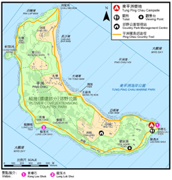
Ping Chau

Article(s): Ping Chau
Request: Do something with them/Create according to the provided sources a map of the Hong Kong island Ping Chau in the area between Dapeng and Sai Kung. It lays in Tai Pang Wan/Mirs Bay, in the north east of Hong Kong. Its very near Dapeng Peninsula and seems like a banana. Helanhuaren (talk) 10:52, 25 March 2009 (UTC)
Graphist opinion: I made a locator map for it, unfortunately the SVG locator maps currently being used for Hong Kong don't go out that far, so I based this on the older PNG locator maps, if anyone else wants to convert it to SVG feel free to do so. You could also probably use the map I made for Dapeng, it isn't labeled on there but it is clearly visible. Kmusser (talk) 13:39, 25 March 2009 (UTC)
PDF conversion
Article(s): Nizhny Novgorod and several other articles, including those in the Russian segment of Wikipedia.
Request: Recently, Russian Graphic Lab has received a request that none of our specialists can handle. Nizhny Novgorod's city administration posted online several schemes (supposedly in public domain), that give some very useful information on the city's development plan, transportation, zoning and general borders. Russian user made a request to extract the layers from PDF file and place them into SVG, AI or CDR files. After several attempts, it turned out that members' computers didn't have sufficient resources to proceed the request and all of the attempts have failed. Though, we were able to identify that the files were all created in AutoCAD and then converted to PDF. Now, if there is any chance to do this, could someone here at the English Graphic Lab help us and complete the request? Thanks in advance. --Ahnode (talk) 12:39, 29 March 2009 (UTC)
- Summary scheme of the functional planning organization of the city's territory 17 mb
- Functional zoning scheme 17 mb
- Scheme drawing of areas and sites of historical and cultural heritage 38 mb
- Road development scheme 8 mb
Graphist opinion:
Arial like font
Hi, I'm editing an svg file using the arial font. I'd like to replace one supported by the commons svg engine to be able to control the final look better in inskcape. Which font resembles arial the most? Not only looks but also size because a lot of the supported fonts look stretched horizontally. Thanks, Richardprins (talk) 19:15, 29 March 2009 (UTC)
- I don't know of any way to do this. There are two options: The first is to export the SVG as a png, using the png in articles and having the svg available only for translation. I recommend this one. The second is to convert the text into a path. This makes the file larger and makes translating the file more cumbersome but it will preserve your font choice. vıdıoman 20:40, 29 March 2009 (UTC)
https://bugzilla.wikimedia.org/show_bug.cgi?id=8898 ¦ Reisio (talk) 01:31, 30 March 2009 (UTC)
map of the Kashmir region
On 3/23/09, Atelerix wrote to Saravask:
Hello, Saravask,
I wonder if you would be interested in updating your excellent map of the Kashmir region at http://commons.wikipedia.org/wiki/File:Kashmir_map.svg by showing the names and boundaries of the now seven districts of the Northern Areas. The names and boundaries which you currently show within the Northern Areas, i.e., Gilgit Agency, Tribal Areas, and Chilas, ceased to be administrative dvisions of the Northern Areas a long time ago. The names and boundaries of the seven districts into which the Northern Areas is now divided may be viewed at the following website:
http://en.wikipedia.org/wiki/Northern_Areas
If you have any questions, please feel free to contact me.
Regards,
Atelerix
_____________________________________________________________________________________________
On 3/31/09, Saravask wrote to Atelerix:
Hi. Thanks for your request. I am unable to update it now because I am travelling. Please consider the Graphics Lab instead.
Regards
- How is this? Phizzy 02:00, 1 April 2009 (UTC)
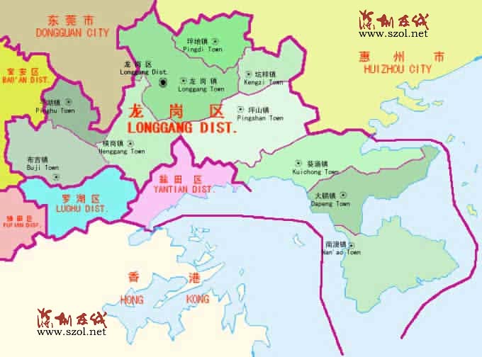
Dapeng subdistrict

Article(s): Dapeng
Request: Do something with them/Create according to the provided sources a map of Dapeng subdistrict in Longgang Helanhuaren (talk) 08:59, 1 April 2009 (UTC)
Graphist opinion: I just added a dot to the Longgang District map. Also added the standard Chinese locator map to the article. Kmusser (talk) 15:09, 1 April 2009 (UTC)
Bermuda
-
 The only PD map currently available.

Article(s): Bermuda
Request: Please create an svg map like these: [7], [8][9], since there isn't one made currently. Here are some example ones: [10] [11] 92.8.99.201 (talk) 19:13, 3 April 2009 (UTC)
Graphist opinion:
Assassination map

_in_Afghanistan.jpg)
![[3]](/wiki/File:705x466-Suisse_topog_5%C2%B05_11%C2%B0_45%C2%B05_48%C2%B0.PNG)
![[4]](/wiki/File:Israel_location_map.svg)
![[5]](http://www.worldmapper.org/images/largepng/2.png)
![[6]](http://www-personal.umich.edu/~mejn/cartograms/population1024x512.png)
![Ukrainian SSR in early 1939, after the Peace of Riga and the consolidation of USSR. (see also animated version with administrative divisions [1])](/wiki/Special:Upload?wpDestFile=1939UkrSSR.JPG)
![[1]](/wiki/File:Ukraine_1937-1939.png)
![[7]](/wiki/File:Falkland_Islands_topographic_map-en.svg)
![[8]](/wiki/File:Gibraltar_map-en.svg)
![[9]](/wiki/File:Isle_of_Man_topographic_map-en.svg)
![[10]](http://media.maps.com/magellan/Images/BERMUD-W1.gif)
![[11]](http://www.hwn.org/ftpshare/pub/bermuda.jpg)
Article(s): Many
Request: Create a more detailed image by adding numbers that show where the assassins were like this [12], more detailed routes, and place a key in the bottom right corner that includes this key [13] and the key in this image [14]. Rename Frans Josef to France Joseph, Latiener bridge to Latin bridge, and RIver Miljacka to Miljacka river. PRODUCER (talk) 17:40, 3 April 2009 (UTC)
![[12]](http://www.ww1-propaganda-cards.com/images/saramap.JPG)
![[13]](http://www.ww1-propaganda-cards.com/images/sarakey.JPG)
Graphist opinion:
Genetic maps of Europe
-
None now
-
None now
Article(s): Ethnic groups in Europe, Genetic history of Europe
Request: Create these maps: 1) News article: [15] Journal article: [16] 2) Gene Expression: [17] Journal article: [18] Phoenix of9 (talk) 19:25, 3 April 2009 (UTC)
Graphist opinion: