
Wikipedia:Graphics Lab/Illustration workshop/Archive/Mar 2010
Stale
Carteret Islands

Article(s): Carteret Islands
Request: Rotate the image about 70 degrees clockwise so north is at the top... Chris (クリス • フィッチュ) (talk) 10:32, 8 February 2010 (UTC)
Graphist opinion(s): Not a simple and straight-forward job. The rotation is, but an awful lot of sea and clouds would need to be cloned in order to fill out the gaps once the rotation is completed. --Fred the Oyster (talk) 13:41, 8 February 2010 (UTC)
- Or just leave it as blank space for now, we'll see what it looks like at that point. Cheers. --Chris (クリス • フィッチュ) (talk) 13:40, 9 February 2010 (UTC)
Coat of Arms of Yugoslav Kingdom
-
 Coat of Arms of the K. of Yugoslavia

Article(s): Kingdom of Yugoslavia
Request: Hi to all. Actually, wiki has the image above as CoA of the K. of Yugoslavia. However, how it can be seen [1], [2], [3], [4], the real CoA was more simple, and the crown was a bit different. Can anybody solve the problem? Thanks. 95.237.154.119 (talk) 17:35, 10 February 2010 (UTC)
Graphist opinion(s):
E.T. Logo
-
 Opening logo to the film E.T. the Extra-Terrestrial
 -
Original JPG.
Article(s): 1980s
Request: Need help removing the spaces between the shapes. TheCuriousGnome (talk) 18:10, 10 February 2010 (UTC)
Graphist opinion: I'm afraid there are more problems to this image than just the distance between letters. The gradient is showing significant banding with obvious paths between each shade change. Additionally the licensing of the image is way off. This is a screenshot from a well known movie. The image you have chosen is iconic of that movie, also are you aware that when a movie is copyrighted, every single frame of that film holds that self-same copyright? --Fred the Oyster (talk) 18:24, 10 February 2010 (UTC)
- Are you sure it still falls under the movie's copyright, if the logo is fully extracted from the frame? After all, you could derive it from a multitude of other sources as well. I think it can/should be viewed as a separate copyright entity. But I'm no copyright expert, of course. As for the SVG – I think the logo should be either re-traced by hand or be cleaned up and made a bitmap image. Right now it's a terrible mess. —Quibik (talk) 19:16, 10 February 2010 (UTC)
- I assumed it was OK after I saw this image. There was a deletion debate over the Star Wars Logo.svg and it resultd on a majority agreeing to keep it based on {{PD-textlogo}}. The source of the original image from which the SVG was generated was a promotion poster. TheCuriousGnome (talk) 19:36, 10 February 2010 (UTC)
- OK. I tried to redo it in a more simplistic way. I am attaching the original jpg just in case any one can do a better job. TheCuriousGnome (talk) 21:51, 10 February 2010 (UTC)
- I assumed it was OK after I saw this image. There was a deletion debate over the Star Wars Logo.svg and it resultd on a majority agreeing to keep it based on {{PD-textlogo}}. The source of the original image from which the SVG was generated was a promotion poster. TheCuriousGnome (talk) 19:36, 10 February 2010 (UTC)
Guyana coat of arms
-
Guyana Coat of Arms
Article(s): Guyana (and many many many other language versions)
Request: I need an SVG version of this! I tried to make one, but I couldn't get it right. Mine looked too blurry and distorted. Someone help out? Cheers, Nesnad (talk) 13:04, 18 February 2010 (UTC)
Graphist opinion(s):
- You can buy a professional version here. --Shandristhe azylean 14:23, 18 February 2010 (UTC)
- The user needs one for here at Wikipedia, not personal use. --Chris (クリス • フィッチュ) (talk) 03:10, 20 February 2010 (UTC)
Coat of arms of Grand Ducal Police
-
 Coat of Arms of Luxembourg

Article(s): Grand Ducal Police
Request: Create the coat of arms of Grand Ducal Police (Police Grand-Ducale) from CoA of Luxembourg, [5], [6], [7], [8]. Thanks. GJo (talk) 11:56, 21 February 2010 (UTC)
Graphist opinion(s):
Voyager Golden Record: vectorization of cover explanation
-
 Original JPEG
(former version) -
 My SVG attempt
(currently in the article) -
 The Pioneer plaque


.svg?lang=en)
Article(s): Voyager Golden Record
Request: Last month, I made (by hand, using Inkscape) an SVG version of the record cover explanation given by NASA. However, it is more than double the file size of the original JPEG. Its details also are somewhat inconsistent and inaccurate to the original (for example, the dashes in the binary codes are inconsistent). I would like assistance with improving this vectorization. Is it worth it or should I just convert the JPEG into 1-bit PNG and nominate the SVG for deletion? Note that many of the symbols on the record cover originally were on the earlier Pioneer plaque. Linked from that image's description page are SVG files that have some, but not all, of the individual symbols. There should also be a photo of the actual record cover in the article linked to above. PleaseStand (talk) 21:49, 22 February 2010 (UTC)
Graphist opinion(s):
Resolved
Scrabble

Done: Cropped, removed background. File:Scrabble United States.png

Done: Opaque background removed
Article(s): Scrabble
Request: Cleanup... Chris (クリス • フィッチュ) (talk) 02:16, 25 February 2010 (UTC)
Graphist opinion(s):
![]() Request taken by Fred the Oyster.
Request taken by Fred the Oyster.
![]() Done
Done
- Thanks, Fred! --Chris (クリス • フィッチュ) (talk) 01:33, 28 February 2010 (UTC)
Diagrams for MOSFET
-
 Done
Done -
 Vectorised
 -
 Done
Done -
 Vectorised
 -
 Done
Done -
 Vectorised
 -
 Done
Done -
 Vectorised


Article(s): MOSFET
Request: Vectorize JovianEye (talk) 05:06, 27 February 2010 (UTC)
- Wow! That was really fast!! --JovianEye (talk) 18:40, 27 February 2010 (UTC)
Graphist opinion(s):
![]() Request taken by Fred the Oyster.
Request taken by Fred the Oyster.
![]() Done
Done
Left & Right hand traffic
-
 Done
Done -
 Vectorized
 -
 Done
Done -
 Vectorized


Article(s): Right- and left-hand traffic
Request: Vectorize JovianEye (talk) 06:31, 1 March 2010 (UTC)
- Thanks a lot! --JovianEye (talk) 00:56, 2 March 2010 (UTC)
Graphist opinion(s):
![]() Request taken by Parutakupiu.
Request taken by Parutakupiu.![]() Done — Parutakupiu (talk) 00:28, 2 March 2010 (UTC)
Done — Parutakupiu (talk) 00:28, 2 March 2010 (UTC)
NORAD tracks Santa
-
 Before
 -
 After
After


Article(s): NORAD tracks Santa
Request: Trim away beige background and shading... Chris (クリス • フィッチュ) (talk) 09:09, 1 March 2010 (UTC)
Graphist opinion(s):
![]() Request taken by Fred the Oyster.
Request taken by Fred the Oyster.
![]() Done
Done
- Perfect, thank you! --Chris (クリス • フィッチュ) (talk) 04:50, 4 March 2010 (UTC)
Flag of the Prime Minister of Cuba
-
 Original
 -
 Vector version


Article(s): none
Request: Vectorize. Should be easy. Thanks. Connormah (talk | contribs) 04:41, 3 March 2010 (UTC)
Graphist opinion(s):![]() Done --JovianEye (talk) 06:52, 3 March 2010 (UTC)
Fred the Oyster (talk) 00:35, 4 March 2010 (UTC)--
Done --JovianEye (talk) 06:52, 3 March 2010 (UTC)
Fred the Oyster (talk) 00:35, 4 March 2010 (UTC)--
Undersecretary of the Navy/Army flags
-
 raster Under Secretary of the Navy flag
 -
 Done
Done -
 raster Assistant Secretary of the Navy flag
 -
 Done
Done -
 raster United States Assistant Secretary of War flag
 -
 Done
Done -
 vector example of United States Secretary of the Navy flag
 -
 vector example of United States Secretary of the Army flag


Article(s): Under Secretary of the Navy, Assistant Secretary of the Navy, transcluded via {{USSecNavy}} onto ~200+ pages; United States Under Secretary of the Army, United States Assistant Secretary of War, and transcluded via {{USSecArm}} onto ~100+ pages
Request: Vectorize the three raster flag images. Hopefully, you can just take the current vectors and change the colors as needed, they are otherwise (supposed to be) identical. bahamut0013wordsdeeds 14:09, 4 March 2010 (UTC)
- All done, but I haven't updated any of the templates they're transcluded in, or even tagged the other images as having a vector version available. Too busy. --Fred the Oyster (talk) 15:16, 4 March 2010 (UTC)
- Great, thanks! bahamut0013wordsdeeds 00:03, 5 March 2010 (UTC)
Graphist opinion(s):
![]() Request taken by Fred the Oyster.
Request taken by Fred the Oyster.![]() Done--Fred the Oyster (talk) 15:16, 4 March 2010 (UTC)
Done--Fred the Oyster (talk) 15:16, 4 March 2010 (UTC)
Medal of Honor
-
 Medal of Honor, Navy version used 1913 to 1942
.png?lang=en)
Article(s): Medal of Honor, and all pages currently using File:NavyMOH 1913-1942.jpg
Request: Please make background transparent. I was meddling with it in Adobe Photoshop, but when I flattened the image, the transparency disappeared? Anyway, I'm starting to replace all uses of File:NavyMOH 1913-1942.jpg with this image, so renaming it would not be useful; please override the current one at Commons. bahamut0013wordsdeeds 00:45, 5 March 2010 (UTC)
- In Photoshop, instead of flattening layers, use merge visible layers instead. Flattening throws away the transparency. Or alternatively if saving as a PNG, keep the layers the way they are and choose "save for web/devices", then when you choose PNG you have the option of maintaining the transparency. --Fred the Oyster (talk) 01:07, 5 March 2010 (UTC)
- To be 100% honest, I didn't do a very good job of it anyway. I feel better that a competent graphist took this task on. I do appreciate the advice, however. bahamut0013wordsdeeds 01:14, 5 March 2010 (UTC)
Graphist opinion(s):
![]() Request taken by Fred the Oyster.
Request taken by Fred the Oyster.
![]() Done
Done
Qantas
{{resolved}}
-

-
 Vectorised
 -
Vectorised
Article(s): Qantas
Request: SVG, in red instead of black, remove dates at bottom... Chris (クリス • フィッチュ) (talk) 11:01, 21 February 2010 (UTC)
Graphist opinion(s): I've done the second one, using the existing SVG. Still need the other doing. NikNaks93 (talk) 20:20, 3 March 2010 (UTC)
Scratch that. Done the other as well. NikNaks93 (talk) 19:50, 4 March 2010 (UTC)
![]() Request taken by NikNaks93.
{{Done}}
Request taken by NikNaks93.
{{Done}}
- Thank you, they look great! The font on the first one is a little different, I will see if I can find a better match. It's a common style for that period, but not so much in use now. --Chris (クリス • フィッチュ) (talk) 13:13, 5 March 2010
- Absolutely. I'll happily make the change if you can find a better font! NikNaks93 (talk) 16:15, 5 March 2010 (UTC)(UTC)
Austrian Airlines Logo
Article(s): Austrian Airlines
Request: This SVG file was taken from an official PDF source here. The file is displaying perfectly in Inkscape but is not being displayed properly by the Wikimedia server. What can be done to fix this? JovianEye (talk) 20:24, 5 March 2010 (UTC)
Graphist opinion(s):
Cracked it after three attempts. I re-extracted it from the PDF in Adobe Illustrator and expanded the paths/group that made up the curve and the gradient. I scaled it up a bit and et voila it displays properly now, or at least it does in Firefox anyway.
![]() Request taken by Fred the Oyster.
Request taken by Fred the Oyster.
![]() Done
Done
- I think the problem originated from the gradient that was embedded as a bitmap image. Fred's version was still using it, so I uploaded a new version with a real gradient. —Quibik (talk) 21:13, 5 March 2010 (UTC)
- Thanks a lot guys!! --JovianEye (talk) 21:24, 5 March 2010 (UTC)
1st Medical Battalion
-
Poorly-made SVG
-
 Original JPEG
 -
 EGA to use on left
 -
 Navy seal to use on right
 -
 good caduceus to use
 -
 Done
Done


.svg?lang=en)
Article(s): 1st Medical Battalion, various lists of units
Request: The original author merely ocnverted a very low-resolution version of the logo, and as a result, distorted many details. The Eagle, Globe, and Anchor on the left looks more like a smear, and the Navy seal on the right isn't much better. The caduceus is horrid: it looks like a strand of DNA growing bat wings and a cotton swab in the center. The lettering ins't so hot, either. I'm hoping a graphist can correct the poor converstion with the good examples I'be provided. bahamut0013wordsdeeds 23:14, 5 March 2010 (UTC)
- You are pretty darn awesome, Fred. Thanks! bahamut0013wordsdeeds 02:52, 6 March 2010 (UTC)
Graphist opinion(s):
![]() Request taken by Fred the Oyster.
Request taken by Fred the Oyster.![]() Done
Done
Hanshin Tigers
-
 Original
 -
 Vector


Article(s): Hanshin Tigers
Request: Smooth out graininess... Chris (クリス • フィッチュ) (talk) 00:27, 6 March 2010 (UTC)
Graphist opinion(s): It's an easy one and I had 5 minutes spare :) --Fred the Oyster (talk) 01:27, 6 March 2010 (UTC)
![]() Request taken by Fred the Oyster.
Request taken by Fred the Oyster.
![]() Done
Done
- Great! I boosted it back up to the yellower one. --Chris (クリス • フィッチュ) (talk) 11:29, 6 March 2010 (UTC)
IIM Lucknow Logo
Article(s): Indian Institute of Management Lucknow
Request: The SVG logo for this institution can be obtained from this official PDF here. The logo on the last page is the best version. The logo is being displayed properly in Inkscape but not by the Wikimedia server. Please help me fix this! (The motto of the institution is in raster form, dont trouble yourself vectorizing it!) JovianEye (talk) 20:26, 6 March 2010 (UTC)
- Thanks a lot for fixing it! Given the amount of discussion regarding non-free logos on this page itself, I would suggest to leave the motto in raster form. Any effort to vectorize it would be a waste! We could upload a better version of the logo when IIM Lucknow publishes a PDF where the entire logo is in vector form.
Graphist opinion(s): ![]() Done I traced the logo text for now. If you can write it out in Sanskrit I might be able to place it on a path in Inkscape which will look better. -- RA (talk) 11:10, 7 March 2010 (UTC)
Done I traced the logo text for now. If you can write it out in Sanskrit I might be able to place it on a path in Inkscape which will look better. -- RA (talk) 11:10, 7 March 2010 (UTC)
Tawny Owl

Article(s): Tawny Owl
Request: Trim away extra blank space... Chris (クリス • フィッチュ) (talk) 08:27, 7 March 2010 (UTC)
Graphist opinion(s): ![]() Request taken by Rannpháirtí anaithnid.
Request taken by Rannpháirtí anaithnid. ![]() Done I also increased the size of the text so it would be readable at standard thumbnail size. -- RA (talk) 10:35, 7 March 2010 (UTC)
Done I also increased the size of the text so it would be readable at standard thumbnail size. -- RA (talk) 10:35, 7 March 2010 (UTC)
- Great, thank you! --Chris (クリス • フィッチュ) (talk) 12:17, 7 March 2010 (UTC)
Wikipedia:Wikipe-tan
-
Attempt Mark 4.
-
 Also added, just for laughs, my version of the 3-fingered salute.
 -
 Additional version incorporating Kasuga's Wikipe-tan design.


Article(s): Wikipedia:Wikipe-tan
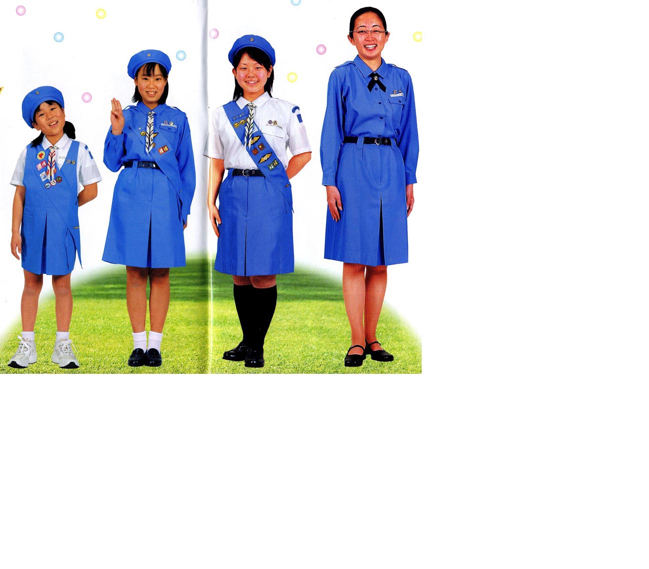
Request: create a Wikipe-tan Girl Scouts of Japan Girl Scout in a round hat like the first little girl in the corner of http://www.girlscout.or.jp/ for the all Girl Scout/Guide theme for the March 2010 WikiProject Scouting portal, and later to enhance Wikipedia:WikiProject Scouting/Girl Guiding and Girl Scouting task force? (using the three finger sign as in File:Plast - Scout Salute.jpg) Thank you ahead of time! Chris (クリス • フィッチュ) (talk) 08:04, 1 March 2010 (UTC)
Graphist opinion(s):
![]() Request taken by Fred the Oyster.
Request taken by Fred the Oyster.
- The first attempt isn't a free image for 2 reasons. 1) the Wikipedia globe is copyrighted, and cannot be used in such instances 2) the smiling girl is clearly a derivative work of this, and would also still be copyrighted by girlscout.or.jp. I needs to be deleted from the Commons (and because of it's non-free nature, isn't appropriate for a WikiProject, due to the limitation of non-free content outside of the article namespace WP:NFCC #9). But with modification, I'm sure something along these lines would be acceptable for sure. Good start! -Andrew c [talk] 22:44, 1 March 2010 (UTC)
- I'll give you the Wikipedia logo, which I have to say is hypocritical of the foundation, given that the image was on Commons and isn't free. I will argue that the face isn't a derivative per se. The image is change substantially from the image in the link you gave. It didn't contain the 90, the pattern on the neckerchief is different, as are the colours. Not to mention that it's now part of a totally different design. Think of it as akin to being a music sample. Similar enough to be recognised, different enough to be considered a new design. Anyway, just to be sure I've changed the face quite dramatically now whilst trying to maintain the recognisable image. I do find it amusing though that you come up with all the above yet totally missed the typo! --Fred the Oyster (talk) 01:02, 2 March 2010 (UTC)
- Fred, that is so cool! When I made the request, I wasn't thinking about a badge, I was thinking about a full-standing Wikipe-tan, but your idea is great! Now comes (I know, I know...) the changes. This is not for the Girl Scouts of Japan article, I want her to be Japanese because Wikipe-tan is Japanese. So the text should really be Girl Guiding and Girl Scouting, you can put some above and some below. I like the map of Japan, I have several badges that have that, you really do have an eye for this sort of thing. However, because it's not just Japan, maybe could you change the background to the logo of the Scouting WikiProject? It is free use as we made it ourselves, the colors and shape don't match any national emblem, we created it for any generic use. And I love her neckerchief, you really have great attention to detail! Thank you for your hard work! --Chris (クリス • フィッチュ) (talk) 04:46, 4 March 2010 (UTC)
- Wow you rock! Can you make her hand match her flesh tones? Can you put the blue beret back on her? If you want, use the kanji (祖, so) from her hairtie-puzzle piece as the badge for her hat, and take off Wikipe-tan from the text, she doesn't need to be named and that will let you stretch out the rest of the text. --Chris (クリス • フィッチュ) (talk) 11:46, 4 March 2010 (UTC)
- I'm not sure if the hat works, I've been looking at it too long and stretching and deforming it to sort of look right. I filed the gap at the bottom with the kanji characters after having first tried another smaller version of the fleur-de-lys. But for some reason it kept breaking in svg form and the right-hand 'branch kept on disappearing to various places on the image. The gap does need filling though, but I wasn't sure quite what to fill it with! --Fred the Oyster (talk) 16:26, 4 March 2010 (UTC)
- Since this is the Guiding 2010 Centenary, how about replacing the kanji at the bottom with 2010 or 100? Also, I'm eyeballing it here, so it is completely OR, but the hat and the uniform are closer to 6495ED Cornflower blue or File:Union of Burma Girl Guides Association 1950.svg, somewhere in between. And if you can, slightly thinner lines around her hand, so it matches her face. --Chris (クリス • フィッチュ) (talk) 13:24, 5 March 2010 (UTC)
- The blue on the necktie is #0052D6 (0,82,214) as discussed in a previous thread on Scouting colours, the orange/gold is #FE8F03 (254,143,3). The hat starts off as #0052D6 but is a radial gradient to black. As for the gap, I can fill it with whatever you like, as I said on you talk page, I have no knowledge whatsoever on the scouting movement so I'll leave it to your superior knowledge. --Fred the Oyster (talk) 13:45, 5 March 2010 (UTC)
- Neckerchiefs come in all sorts of colors-the color/pattern you chose is great! Each country has their own color uniforms, some are nice, some are weird. Just the hat needs a lighter shade of blue (maybe radial gradient between the two shades I found?), and I think 100 is maybe the best bottom text. --Chris (クリス • フィッチュ) (talk) 23:52, 5 March 2010 (UTC)
- Which two shades of blue? The existing one obviously, but which other shade and how light is light? Please remember that the gradient is there to show some curve and shadowing, so if the two shades are too close together that effect will be lost. --Fred the Oyster (talk) 13:24, 6 March 2010 (UTC)
- Can you match the blue from File:Union of Burma Girl Guides Association 1950.svg, and gradient away from there, but to darker blue, not to black? --Chris (クリス • フィッチュ) (talk) 08:30, 7 March 2010 (UTC)
- I've now changed the hat (and a few other little gradient tweaks) gradient to a gradient mesh. I've used three shades of blue; the existing blue, the Burma blue and a navy blue (right on the very edges). I'm not sure though if I should tone down the brighter blue and do a better blend. What do you think? --Fred the Oyster (talk) 14:46, 7 March 2010 (UTC)
- Okay, I've been thinking, this is so close...
- Please remove or make the hat brim smaller, it's a beret, now looks kind of ball-cappish
- I found some decent (not great, a little dark and small) pics- http://www.yokoi.com/girlscout/uniform1.jpg
- The orange border is ok, but against the light blue it is distracting, can you change the orange hat badge disk to
 , and make her neckerchief slide match?

--Chris (クリス • フィッチュ) (talk) 05:48, 8 March 2010 (UTC)
- ps-also you can use the same font for 100 as you did the other lettering. --Chris (クリス • フィッチュ) (talk) 15:08, 8 March 2010 (UTC)
- How's this version? I didn't have time to vectorise the orchid so had to embed it. It's only small so didn't increase the file size too much. Close to final version yet? --Fred the Oyster (talk) 15:56, 8 March 2010 (UTC)
- ps-also you can use the same font for 100 as you did the other lettering. --Chris (クリス • フィッチュ) (talk) 15:08, 8 March 2010 (UTC)
- She's perfect, Fred, ready to go! --Chris (クリス • フィッチュ) (talk) 02:27, 9 March 2010 (UTC)
A picture is worth a thousand words
-
 comic strip

Article(s): A picture is worth a thousand words
Request: Vectorize. Cybercobra (talk) 09:54, 5 March 2010 (UTC)
Graphist opinion(s):
- Just curious why you want this vectorized? We will never be able to re-create the line quality of the inking used (notice the wavy lines on the shirt, the quality of the lines that make up the box, and how the line on the head gets thin then thick then thin again, etc) . I could understand this request more if I knew what specific application you thought SVG would be superior, but if we are trying to represent the artist's work, no SVG conversion would do that justice. -Andrew c [talk] 14:38, 5 March 2010 (UTC)
- I had a quick try at a combination of a Live Trace and manual tracing in Illustrator and I couldn't come close to re-creating the line work. Which after all is the crux of a cartoonist's work. I'd suggest not bothering. --Fred the Oyster (talk) 20:58, 5 March 2010 (UTC)
- I agree completely (and I fired up illustrator to check out the autotrace as well). That said (ha) this is a freely licensed file, and the author did agree to future modifications and re-use, so I wouldn't oppose a separate SVG, if there was a purpose. I just can't think of an encyclopedic purpose on WIkipedia (unless we are trying to demonstrate an auto-trace feature, and have a side by side comparison or something like that). I would oppose the SVG trying to represent the artist's work, but wanted to see the requestor's intention. -Andrew c [talk] 22:21, 5 March 2010 (UTC)
- On the article in question, the rescaling causes quite visible and unsightly artifacts; most significantly, the text is quite hard to read. --Cybercobra (talk) 22:58, 5 March 2010 (UTC)
- I agree completely (and I fired up illustrator to check out the autotrace as well). That said (ha) this is a freely licensed file, and the author did agree to future modifications and re-use, so I wouldn't oppose a separate SVG, if there was a purpose. I just can't think of an encyclopedic purpose on WIkipedia (unless we are trying to demonstrate an auto-trace feature, and have a side by side comparison or something like that). I would oppose the SVG trying to represent the artist's work, but wanted to see the requestor's intention. -Andrew c [talk] 22:21, 5 March 2010 (UTC)
- I had a quick try at a combination of a Live Trace and manual tracing in Illustrator and I couldn't come close to re-creating the line work. Which after all is the crux of a cartoonist's work. I'd suggest not bothering. --Fred the Oyster (talk) 20:58, 5 March 2010 (UTC)
Someone resized the image, and that seems to have sufficiently mitigated the problem. --Cybercobra (talk) 16:36, 8 March 2010 (UTC)
Wezombeli
Article(s): Wezombeli
Request: Sharpen... Chris (クリス • フィッチュ) (talk) 12:28, 8 March 2010 (UTC)
Graphist opinion(s): I've sharpened it, but as there aren't many pixels to work with there's a limit as to what could be done with this image. Would it not be worthwhile contacting the relevant association and asking if it would be possible to appropriate the original artwork, or at least a higher resolution one. After all it is in their interests. --Fred the Oyster (talk) 14:45, 8 March 2010 (UTC)
![]() Request taken by Fred the Oyster.
Request taken by Fred the Oyster.
![]() Done
Done
- It would, but most African countries orgs are too small/poor... to have the resources to even respond. Hence all the Girl Scout stuff. --Chris (クリス • フィッチュ) (talk) 02:21, 9 March 2010 (UTC)
Rub el Hizb
-
 ROUB EL HIZB 06DE.svg
Done -
 U+06DE.svg
Done


Article(s): Rub el Hizb
Request: Trim away blank space... Chris (クリス • フィッチュ) (talk) 12:32, 8 March 2010 (UTC)
Graphist opinion(s):
Also did File:U+06DE.svg for good measure. --Fred the Oyster (talk) 13:26, 8 March 2010 (UTC)
![]() Request taken by Fred the Oyster.
Request taken by Fred the Oyster.
![]() Done
Done
- Thank you! I have no idea why the second one was made, which brought my attention in the first place. --Chris (クリス • フィッチュ) (talk) 14:39, 8 March 2010 (UTC)
Tonga branch of The Scout Association
Article(s): Tonga branch of The Scout Association
Request: Center crown just slightly... Chris (クリス • フィッチュ) (talk) 16:02, 8 March 2010 (UTC)
Graphist opinion(s): As it happened most of the mitre was off-centre, nothing was aligned and even the horizontal paths overshot the edges. --Fred the Oyster (talk) 17:23, 8 March 2010 (UTC)
![]() Request taken by Fred the Oyster.
Request taken by Fred the Oyster.
![]() Done:
Done:
- Better, thank you! --Chris (クリス • フィッチュ) (talk) 02:19, 9 March 2010 (UTC)
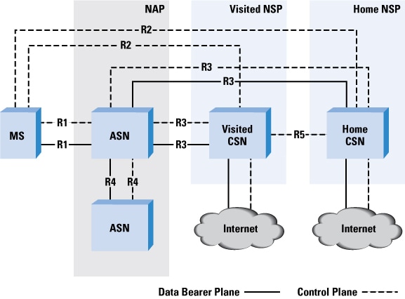
WiMAX Architecture
-
 PNG Version
 -
 Done
Done


Article(s): WiMAX
Request: Vectorize. --JovianEye (talk) 00:11, 9 March 2010 (UTC)
- The dotted lines between CSN and ASP Network are missing! Please add them. --JovianEye (talk) 14:48, 9 March 2010 (UTC)
- I have removed R8 from the figure! It is a factual error in the original file. The original file has several factual errors! User this figure as a reference. I think it would be better to include the legend as shown in the Cisco diagram. --JovianEye (talk) 15:09, 9 March 2010 (UTC)
- All done with the corrections, I used the colouring from the Cisco diagram. --Fred the Oyster (talk) 16:27, 9 March 2010 (UTC)
- Perfect! --JovianEye (talk) 16:59, 9 March 2010 (UTC)
- All done with the corrections, I used the colouring from the Cisco diagram. --Fred the Oyster (talk) 16:27, 9 March 2010 (UTC)
Graphist opinion(s):
![]() Request taken by Fred the Oyster.
Request taken by Fred the Oyster.
![]() Done:
Done:
Emblem of India

Article(s): Plenty
Request: Given the importance of this emblem, I am requesting a little more perfection. First, the bull on the lower right has an eye missing which the parent File:Supreme Court of India.svg does have. Second, between the main emblem and the text there is rectangular portion which was present in 25 Novemeber 2006 version of the file. For an official reference use page 28 of this PDF source. JovianEye (talk) 05:46, 10 March 2010 (UTC)
- Good job! :) --JovianEye (talk) 04:15, 11 March 2010 (UTC)
Graphist opinion(s):
I'll get that sorted later on today. --Fred the Oyster (talk) 10:12, 10 March 2010 (UTC)
![]() Request taken by Fred the Oyster.
Request taken by Fred the Oyster.
![]() Done
Done
coat of arms of Venezuela
.svg?lang=en)
Article(s): coat of arms of Venezuela
Request: The old coat of arms of Venezuela did not contain "Bolivarian" until Chavez, so most coats of arms in the category on Commons are incorrect, this one has the text right but the drawing is weak... better SVG duplicated, and the word "Bolivariana" removed from it, to match this one Chris (クリス • フィッチュ) (talk) 12:48, 10 March 2010 (UTC)
Graphist opinion(s): I'm not entirely sure what you're after. Do you want the better SVG duplicated, and the word "Bolivariana" removed from it, to match this one? If not, could you be a little more specific? --NikNaks93 (talk) 19:49, 10 March 2010 (UTC)
![]() Request taken by Fred the Oyster.
Request taken by Fred the Oyster.
{{Done}}
- The horse direction and head were changed in 2006, this version now has the new one. Brilliant rest of it, though! --Chris (クリス • フィッチュ) (talk) 11:07, 11 March 2010 (UTC)
- Horse all sorted. --Fred the Oyster (talk) 14:54, 11 March 2010 (UTC)
- The horse direction and head were changed in 2006, this version now has the new one. Brilliant rest of it, though! --Chris (クリス • フィッチュ) (talk) 11:07, 11 March 2010 (UTC)
- Of horse, of horse! Thanks Mr. Fred! --Chris (クリス • フィッチュ) (talk) 17:04, 11 March 2010 (UTC)
Mon
-

-
 SVG
SVG


Article(s): Mon (crest)
Request: Clear background... Chris (クリス • フィッチュ) (talk) 11:05, 11 March 2010 (UTC)
Graphist opinion(s): Done Sodacan (talk) 15:28, 11 March 2010 (UTC)
- Cool, thank you! --Chris (クリス • フィッチュ) (talk) 17:05, 11 March 2010 (UTC)
Ashoka Chakra

Article(s): Several
Request: The white portion in the file should be converted into alpha background. JovianEye (talk) 00:02, 13 March 2010 (UTC)
- Thanks! --JovianEye (talk) 05:45, 13 March 2010 (UTC)
Graphist opinion(s):
![]() Request taken by Fred the Oyster.
Request taken by Fred the Oyster.![]() Done
Done
Flag of Indian Army
-
 PNG Version
 -

-
Done


Article(s): Several
Request: The original vector version of this file has been deleted from Commons for some reason. A vector version currently exists but is of poor quality (File:Flag of the Indian Army.svg). Please recreate the vector version from the PNG version. You can use File:Emblem of India.svg and File:Flag of India.svg to assist in the recreation. Thanks. JovianEye (talk) 19:28, 12 March 2010 (UTC)
There is already an SVG available, I have added it here so you may see Fry1989 (talk) 21:20, 12 March 2010 (UTC)
- Thanks a lot Fred! --JovianEye (talk) 22:50, 12 March 2010 (UTC)
- Whoops, just noticed, the swords are crossed opposite to the png, which is the correct version... I best double check before I alter it?
- I too, cant really say which is right! The issue is there is no clear reference image on the Army Website. This website is quite authoritative but here also it isnt really clear. The rank flag on the website shows the left sword over the right. So I guess this version should be correct! --JovianEye (talk) 00:14, 13 March 2010 (UTC)
- One of these days I'm going to learn not to duplicate the images on Wikipedia, the swords on the flags on that website look nothing like the ones on the above PNG, which of course I replicated (but had to build from scratch). --Fred the Oyster (talk) 00:20, 13 March 2010 (UTC)
- The flag on that website does not even maintain 3:2 aspect ratio! So, I guess your version cannot be criticized. --JovianEye (talk) 21:23, 13 March 2010 (UTC)
- Also should the chakra thingummy-bob on the flag have a central circle like the chakra below? There isn't one in the above version. --Fred the Oyster (talk) 21:33, 13 March 2010 (UTC)
- The central circle should be present. See File:Flag of India.svg. --JovianEye (talk) 21:46, 13 March 2010 (UTC)
- I would have used File:Flag of India.svg in the first place, but there seems to be an error in the SVG code and it just made Illustrator barf. Anyway, I've corrected the chakra using the below illustration. --Fred the Oyster (talk) 21:56, 13 March 2010 (UTC)
Graphist opinion(s):
![]() Request taken by Fred the Oyster.
Request taken by Fred the Oyster.
![]() Done
Done
File:No Smoking.svg

![[1]](http://aes.iupui.edu/rwise/banknotes/yugoslavia/YugoslaviaP24-1000Dinara-1920-donatedsb_f.jpg)
![[2]](http://aes.iupui.edu/rwise/banknotes/yugoslavia/YugoslaviaP25-10Dinara-1926-donatedms_b.jpg)
![[3]](http://aes.iupui.edu/rwise/banknotes/yugoslavia/YugoslaviaP33-1000Dinara-1935-donatedis_f.jpg)
![[4]](http://www.babamim.com/yahoo_site_admin/assets/images/50_dinars.164130300_std.JPG)
![[6]](http://www.police.public.lu/pictures/fr/top_nav/logo_pgd.gif)
![[7]](http://www.police.public.lu/pictures/fr/left_nav/logo_menu.gif)
![[8]](http://www.police.public.lu/actualites/a_connaitre/administration/2004/04/Nouvelle_Numerotation/Numerotation_01.jpg)
Article(s):
Request: Trim away blank space... Chris (クリス • フィッチュ) (talk) 04:22, 14 March 2010 (UTC)
Graphist opinion(s):
![]() Request taken by Jovianeye.
Request taken by Jovianeye.
![]() Done
Done
- Thank you! --Chris (クリス • フィッチュ) (talk) 05:54, 14 March 2010 (UTC)