
Wikipedia:Graphics Lab/Image workshop/Archive/Oct 2008
Stale
Turkish
-
 GIF
GIF -
 SVG shield


Article(s): Coat of arms of Turkey
Request: SVG ification. Arrange. Wheat, star, moon, shield, plume in coat of arms. Animal is wolf.--Lord Leatherface (talk) 20:53, 10 August 2008 (UTC)
Graphist opinion: This request is already on this page. --SelfQ (talk) 21:19, 10 August 2008 (UTC)
- That request appears to have disappeared (Probably as "stale"). 68.39.174.238 (talk) 17:30, 17 August 2008 (UTC)
- I have been looking for a very long time for another version of this image. it would seem that there is none. The shiled itself is an easy part to do, the only main problem ( and the reason why it has not been done) is becouse of the seal bellow the shield and the wheat/feathers arround it. they are no clear enough nor there is a clear text (that i can read) in wich it describes what it should contain. so there is no way to realistically retrace it as svg -LadyofHats (talk) 11:20, 23 August 2008 (UTC)
- Could someone do the shield, at least (Since that seems easy), so when a better resolution image turns up, the rest can be done fairly easily? 68.39.174.238 (talk) 01:14, 3 September 2008 (UTC)
- There's the shield. The rest is definitely not discernible. --pbroks13talk? 06:26, 8 September 2008 (UTC)
Australian Bicentenary
Image:17881988bicentenarylogo.jpg
Article(s): Australian Bicentenary
Request: enlarge and cleanup -- Chris (クリス • フィッチ) (talk) 08:13, 9 September 2008 (UTC)
Graphist opinion:
Kipling's India
-

-
perhaps using this brighter map

Article(s):
Request: wikify -- Chris (クリス • フィッチ) (talk) 03:47, 10 September 2008 (UTC)
Graphist opinion:
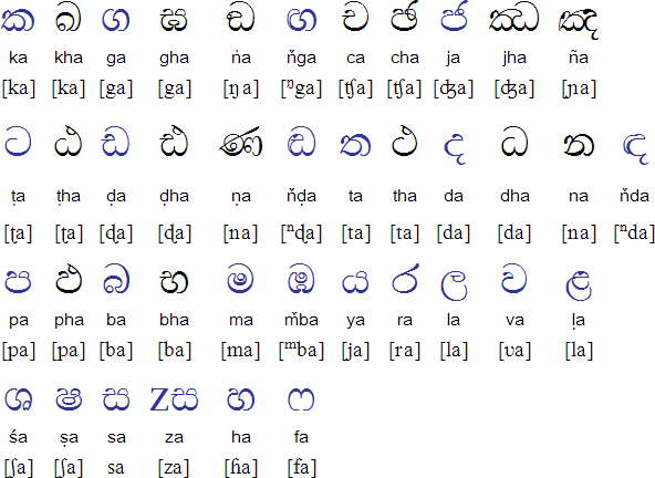
Sinhala letters follow up
-

-
 SVG
SVG -
 SVG WiP
 -
 my amateurish modifications


.svg?lang=en)
.svg?lang=en)
Articles: Sinhala alphabet
Request: Given the nice result of the first try, could you convert the *pdf given above into an *svg and color the segments like shown in the *png?Jasy jatere (talk) 16:02, 8 September 2008 (UTC)
- I just notice that the content in the pdf must be reduced to the table as well, the first two letters are not necessaryJasy jatere (talk) 16:02, 8 September 2008 (UTC)
Graphist opinion: How's that? --pbroks13talk? 23:55, 8 September 2008 (UTC)
- looks good. There are some details which could be improved.
- last character in the k-row, red part: only the bottom "bowl" thick like that, the rest of the red part must be much thinner. Compare the different thickness of lines for p
- the two red characters in the l row have to have a hair stroke on the left, which is very thin. you can use the right column of this table http://www.omniglot.com/images/writing/sinhala_cons.gif as a model.
- for k and r, the pdf has lines of different thickness as well. Could you try to catch that in an svg?
- the r (6) seems unbalanced and very "hand-written", which has to do with line weight as well, I think
- Thanks for you help! Jasy jatere (talk) 10:40, 9 September 2008 (UTC)
- I'd started a work on it but hadn't had a chance to upload until now. I've used the unicode characters from the Sinhala alphabet page (specifically p, k, r and ḷ from the consonants table and the a, u and ū from the vowels table. However, as you can see in the svg above I haven't completed the ku and kū because I can't see which characters in the table match the shapes in the pdf. Do you know which shape it should be, or if it is even in those tables, part of another character, etc? — ₪₪ ch1902 ₪₪ 11:19, 9 September 2008 (UTC)
- for Lu/Luu, you can use the shapes provided for ä/ää.
- for ku/kuu, there are no shapes you could copy in the imgs. The hook for short u is very similar to a Latin 'c'. The hook for uu varies, but if you take the right part of ruu and clip the 'tail' and bend it and then scale the whole thing down, you come close to it (hope that was clear ...)
- Lu/Luu are missing the hairstroke on the left
- smaller notes:
the right arm of p should not touch the belly - The relative differences in thickness seem a bit too much, the thick parts can become a bit less Jasy jatere (talk) 12:56, 9 September 2008 (UTC)
- got inkscape and meddled a bit with the img. The L's are fine now. I do not know how to 'cut' stuff, so the red parts for ku and kuu still have their topmost line, which should probably deleted. The z-like part in kuu, ruu and Luu needs to be thicker, but I do not know how to do that either, so I would appreciate help there Jasy jatere (talk) 00:03, 12 September 2008 (UTC)
Alberta Taciuk Processor - convert to SVG
-
Alberta Taciuk Processor (ATP)
Article(s): Oil shale extraction
Request: The PNG is public domain (U.S. Gov). Looks ideal for converting into an SVG file. -- Kaldari (talk) 23:55, 14 August 2008 (UTC)
Graphist opinion: I've had a good go at this one, but the resolution of the image is simply too low to get anything usable. I've also had a look at the source but I can't extract anything from that of significantly better quality. If all you want is a very abstracted view of the main chambers only (the colored bits) it would be possible to create that from scratch. The fine detail underneath the processor, however, is virtually unreadable even when magnified. Debate 木 12:28, 19 August 2008 (UTC)
- Is that stuff down there absolutely critical? EG. I can tell that one part of it is a stairwell, which isn't very helpful other than giving scale... 68.39.174.238 (talk) 03:22, 28 August 2008 (UTC)
- According to the diagram there appears to be a range of other mechanical bits and pieces (motor, shale feed, riding rings, etc), in addition to some of the internal detail, that are too blurry to easily convert to SVG. Whether they are critical to the diagram or not is something only Kaldari can answer. Debate 木 08:58, 28 August 2008 (UTC)
- I don't think those pieces are really critical to the diagram. Have a go at a simplified version and I'll let you know if anything really important is missing. Thanks! Kaldari (talk) 20:19, 12 September 2008 (UTC)
- According to the diagram there appears to be a range of other mechanical bits and pieces (motor, shale feed, riding rings, etc), in addition to some of the internal detail, that are too blurry to easily convert to SVG. Whether they are critical to the diagram or not is something only Kaldari can answer. Debate 木 08:58, 28 August 2008 (UTC)
Scout Handbook
Article(s): Boy Scout Handbook
Request: cleanup image -- Chris (クリス • フィッチ) (talk) 16:20, 8 September 2008 (UTC)
Graphist opinion: Since this is the current edition, it would probably be easiest for someone to just rescan their copy. This one looks weird because it's been laminated and exposed to some water. Unfortunately, I don't have a copy of the 11th edition, or I'd do it myself. I presume we can't just swipe amazon's image? — ʞɔıu 07:40, 9 September 2008 (UTC)
- We absolutely can. As long as we have a fair-use rationale, it's fine. --pbroks13talk? 19:14, 9 September 2008 (UTC)
- Can we do so and match the brightness to the color of this one? Chris (クリス • フィッチ) (talk) 18:03, 12 September 2008 (UTC)
Paintings by Ruskin
-
 Piazza Santa Maria del Pianto, Rome, by John Ruskin
 -
 An Italian Village, by John Ruskin


Article(s): John Ruskin
Request: -- Yann (talk) 21:31, 10 September 2008 (UTC)
- Wait, what's the request? 68.39.174.238 (talk) 21:37, 10 September 2008 (UTC)
- Cleaning the images as possible. Thanks, Yann (talk) 21:43, 10 September 2008 (UTC)
Graphist opinion: I tried to modify the first image for the moment. Unfortunately the the photographed picture is a reproduction print with a very visible halftone raster. I tried to get rid of it using selective gausian blur. What do you think? Unfortunately during the image upload an error occurred on Wikimedia Commons and your original picture disappeared from the history. If you do not have a copy I have it on my hard disk. --pabouk (talk) 15:42, 12 September 2008 (UTC)
University of East Anglia Coat of Arms
-
 University of East Anglia Coat of Arms

Article(s):University of East Anglia
Request: It would be great if this image could be made into an SVG with a transparent background. Note that the image is fair user. Please see the article University of East Anglia to observe the image in question. -- Flaming Ferrari (talk) 00:04, 13 September 2008 (UTC)
Graphist opinion:
Resolved
Image:Cricket - Stumps.png
-
 Cricket stumps :)
 -
 SVG
SVG


Article(s): Cricket among others.
Request: Hello again. Requesting another SVG if anyone has some time. Cheers, Ben (talk) 19:34, 7 September 2008 (UTC)
Graphist opinion: I gave it a shot, SVGs already existed in Polish and Tamil so I used those. How's that? §hep • ¡Talk to me! 22:26, 26 September 2008 (UTC)
- Excellent, thanks! Ben (talk) 17:58, 27 September 2008 (UTC)
Image:Bongo and Bush.jpg
-
Omar Bongo and George W. Bush
Article(s):Gabon, Politics of Gabon, List of heads of state of Gabon, Omar Bongo, Léon M'ba, Bongo from Congo
Request: Could someone crop this so that only Mr. Bongo is showing?-- Your friend Eddy of the wiki[citation needed] 20:49, 14 September 2008 (UTC)
Graphist opinion:
- If it were not for a guy in the background, this would have been a better photo. User:Zscout370 (Return Fire) 07:23, 15 September 2008 (UTC)
- I cropped the other image because it's a better shot of Bongo, and moved that one into the relevant articles. Calliopejen1 (talk) 18:54, 27 September 2008 (UTC)
Computer mouse mechanism
-
 Computer mouse mechanism
 -
 SVG
SVG


Article(s):Mouse_(computing)
Request: -- make into an SVG Thisglad (talk) 10:23, 6 September 2008 (UTC)
Graphist opinion: How would that do? --pbroks13talk? 07:27, 17 September 2008 (UTC)
- That's excellent. Well done. Is it possible to add the the curved arrow next to number 1 or is that too complicated for an SVG? Thisglad (talk) 07:34, 18 September 2008 (UTC)
- Okay. I was reading the FP review for the original image, and there was some question of whether or not the arrow should be there. Either way, hows that? --pbroks13talk? 07:55, 19 September 2008 (UTC)
- Not my request, but did you leave out the "scroller"(geesh lol) on purpose? It's between the two buttons, can't think of a technical name. §hep • ¡Talk to me! 13:23, 19 September 2008 (UTC)
- I was going to add it... but I got really frustrated at is (because the lighting wasnt working for me), so I left it out. Do you think it is really needed? --pbroks13talk? 04:52, 22 September 2008 (UTC)
- thanks for adding that, I'm also not sure how needed that arrow is but felt that others might object to the difference. Can you add a shadow to svg similar to the shadow in the PNG? Thisglad (talk) 00:33, 20 September 2008 (UTC)
- How's that? --pbroks13talk? 04:52, 22 September 2008 (UTC)
- That's great, would it be to much trouble to add a mouse wheel? thanks again. Thisglad (talk) 08:24, 23 September 2008 (UTC)
- How's that? --pbroks13talk? 04:52, 22 September 2008 (UTC)
- Not my request, but did you leave out the "scroller"(geesh lol) on purpose? It's between the two buttons, can't think of a technical name. §hep • ¡Talk to me! 13:23, 19 September 2008 (UTC)
- Okay. I was reading the FP review for the original image, and there was some question of whether or not the arrow should be there. Either way, hows that? --pbroks13talk? 07:55, 19 September 2008 (UTC)
(undent)Not sure if these would help with the center wheel: Image:Souris schema svg.svg or Image:Mouse buttons.svg. Although It appears they might both use the same wheel? and this one Image:Input-mouse.svg §hep • ¡Talk to me! 20:43, 23 September 2008 (UTC)
- Eh, not so much. The angle is completely different. I tried to make one. What do you think? --pbroks13talk? 17:28, 24 September 2008 (UTC)
- Well, it is passed as a FP, so I am assuming this is resolved. --pbroks13talk? 19:25, 29 September 2008 (UTC)
List of sets of countries that border one another
-
 One way of getting four differently-coloured regions to each border one another
 -
 Another way of doing the same thing


Article(s): List of sets of countries that border one another
Request: These two images are fine, but we could do with a third to represent a third way of drawing shapes such that you can get four colours to border one another (per four colour theorem. That is, a circle split in to two differently-coloured regions horizontally, entirely contained within a concentric circle which is split into two differently-coloured regions vertically - similar to the two images we've got already but formed differently. It's far easier to get the concept across in an image than in text as you can perhaps tell.
If possible, it'd be quite useful if the remaining maps could be made as well, per the style used on that article for the examples cited. Thanks, Pfainuk talk 18:02, 28 September 2008 (UTC)
Graphist opinion:
- I can get on this when I get home today. Same colours as above? /Lokal_Profil 14:34, 29 September 2008 (UTC)
- That colour scheme is used throughout the article, and I'd prefer to have it consistent, so yeah, same colours please. It would probably be clearer if we had yellow (cyan, orange, whathaveyou) instead of magenta throughout the article, but I don't think it's a big deal. Thanks, Pfainuk talk 17:07, 29 September 2008 (UTC)
- Done. If you want another colour instead of magenta just give me a shout. /Lokal_Profil 10:09, 1 October 2008 (UTC)
- Thanks very much. Pfainuk talk 10:33, 1 October 2008 (UTC)
- Done. If you want another colour instead of magenta just give me a shout. /Lokal_Profil 10:09, 1 October 2008 (UTC)
- That colour scheme is used throughout the article, and I'd prefer to have it consistent, so yeah, same colours please. It would probably be clearer if we had yellow (cyan, orange, whathaveyou) instead of magenta throughout the article, but I don't think it's a big deal. Thanks, Pfainuk talk 17:07, 29 September 2008 (UTC)